6 Inequality
6.1 About this chapter
One of the criticisms of GDP as a well-being measure is that “GDP ignores the distribution”. GDP is simply an average across the entire economy. It doesn’t tell us who experiences the “economic activity”, beyond the decomposition into sectors or workers and firms. If we look behind these total numbers and consider the distribution of income, we would probably see something like the chart shown in Figure 6.1. The chart is a histogram of income for a simulated income. Most individuals earn an income well below 100 thousand pounds per year, but some earn way more than that. This chapter is about how we can describe such patterns and compare them across countries and across time.
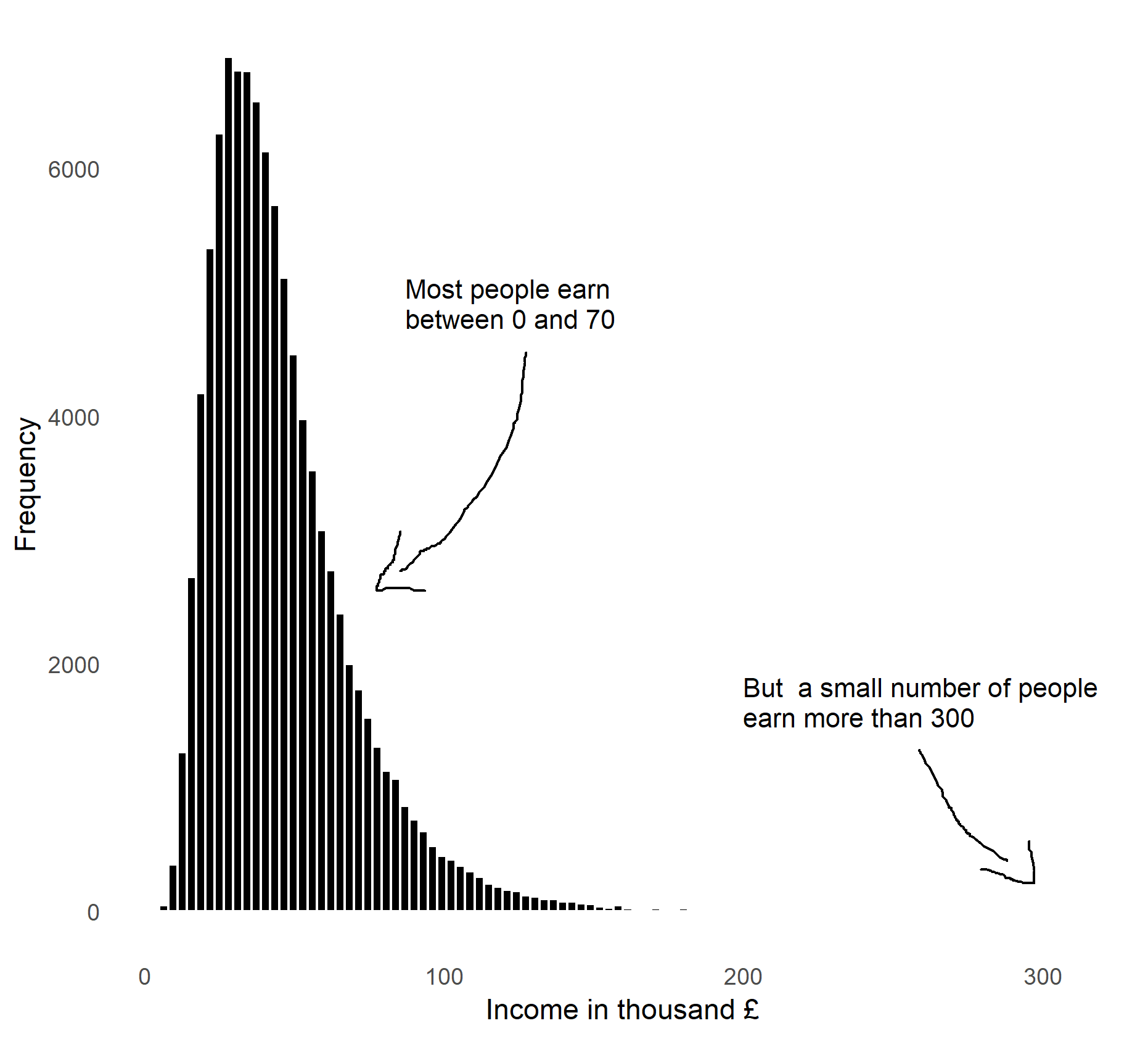
Figure 6.1: The distribution of income. Data is simulated.
6.1.1 Intended learning outcomes
After reading this chapter you should be able to
- Explain the difference between macro and micro level data.
- Explain the data requirements for studying income or wealth inequality.
- Create histograms and compute income shares
- Create a Lorenz curve
- Calculate and interpret the GINI coefficient
6.2 Inequality dimensions
Before we turn to the examples of actual measures of inequality it is worth discussing the multi-dimensionality of inequality. Let’s list of issues.
Inequality across domains: Inequality is not only about income or wealth, it is also about health, law, and access to cultural and natural amenities.
Inequality by gender and race: Inequality is often systematically related to gender and race.
Segregation: Inequality is also closely related to segregation in the society. Do we live together and meet people of different backgrounds?
This list is very far from being exhaustive (you could write books with such lists). The goal of the list is just to help you get started thinking about inequality dimensions and aspects.
6.3 Data requirements
6.3.1 Macro and micro level data
Macro level data
So far we’ve mostly been using macro level data. Macro level data is data about countries, regions or other entities comprising many individuals, households, firms and institutions. An observation in macro data represents the average, the sum or another statistic of these individuals, firms and institutions. We can typically download most macro data from a public source.
Micro level data
In micro level data each observation represents the value for an individual, a household, a firm or an institution. Micro data is often the basis for macro data. It is often based on surveys or administrative records. Micro data is rarely directly accessible from public sources. One reason for this is that micro data often contains a lot of detailed information that shouldn’t be shared freely with everyone. Getting access to micro data therefore often requires us to submit an application and sign a confidentiality agreement. Moreover, when working with micro level data we should be careful about how we share and store the data.
Net and gross values
When assessing the distribution of income within the population it is important first to decide whether we are interested in the net or gross income distribution. We’ve already used the term “net” and “gross” on several occasions. When discussing net-migration or Gross Domestic Product. But what do these terms mean? In general we can think of the terms net and gross as follows:
- Gross: The value without deductions, contributions etc.
- Net: The value after deductions, contributions etc.
We use the terms net and gross in many situations. If you buy packaged food the label might display the gross and net weight. The gross weight will then be the total weight before deductions, the net weight will be the weight of the product after we deducted the weight of the packaging etc.
The most common use of the terms net and gross is probably in income, where gross refers to the income before taxes, and net to the income after taxes. Statistical offices and economists in general agree on excluding taxes from gross terms and including taxes in net terms, but there is less agreement on whether transfers such as housing benefits and unemployment benefits in net terms should be included.
When working with income data, the concept of disposable income is therefore also often used instead. The idea is that we want to consider the income that the household can spend, which will be the income after all taxes, transfers, and deductions.
Equivalenced income
When working with income data we are often interested in comparing households instead of individuals. However, households are not all of the same sizes, and we will therefore have to adjust monetary measures to the size of the households. We call income that is adjusted to household equivalenced income. We will here briefly discuss the three most common approaches to equivalise income.
-
The Oxford scale or OECD equivalence scale.
- The first person in the household: Weight 1
- Each additional adult household member: Weight 0.7 (person aged 14 and over)
- Each child household member: Weight 0.5
-
The OECD modified scale.
- The first person in the household: Weight 1
- Each additional adult household member: Weight 0.5 (person aged 14 and over)
- Each child household member: Weight 0.3
-
The Square root scale.
- Total weight: square root of the number of household members.
While the square root method is probably the most popular approach, the choice of approach is non-trivial as Table 6.1 shows. The table shows four different households that all have the same income, but the composition of households varies. The Oxford scale does for example put quite high weight on children compared to the modified OECD scale. The square root scale on the other hand puts the same weight on adults and children, but each additional member gets a lower weight.
| Adults | 1 | 2 | 1 | 2 |
|---|---|---|---|---|
| Children | 0 | 0 | 1 | 2 |
| Household income | 100 | 100 | 100 | 100 |
| Equivalised income | ||||
| Oxford scale | 100 | 58.824 | 66.667 | 37.037 |
| OECD modified | 100 | 66.667 | 76.923 | 47.619 |
| Square root | 100 | 70.711 | 70.711 | 50.000 |
When working with household income data you should adjust income measures and be aware of the differences between the approaches.
6.4 Income shares
Having discussed inequality dimensions and data requirements we are finally ready to start looking at inequality. But how? How can we summarise the distribution shown in Figure 6.1 in a measure of inequality? If we share a cake among four friends, we would evaluate whether the distribution of cake is equal by assessing whether everyone had an equal share of the cake. Everyone should have 25 percent of the cake. We can conduct a similar exercise with income. Let’s first try this on the simulated example from above. The chart below splits the population 100 percentile groups according to their income.
The 1st percentile has a share of the total income of 0.2%. That is one-fifth of what this group would have if income was equally distributed. In terms of the cake it would correspond to me only getting 5% of the total cake when sharing it with three friends. The person at the 25th percentile has an income share of 0.6%. This is still almost half of what this person would have if income was equally distributed. Looking at the top 1% we observe from the figure that this group gets 3.4% of the income share. That is more than 3 times the equal share. That is like me getting more than 75% of the cake. If we had calculated the share of income of the top 0.1 % we would get that this group got about 0.5% of total income. That is 5 times more than the equal share. Sounds like a lot of inequality? That is nothing compared to actual inequality.
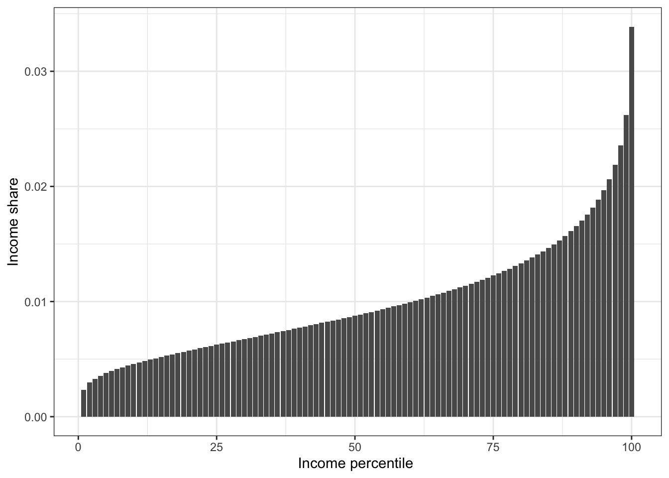
Figure 6.2: Income shares based on simulated data.
Let’s try to look at some real data. We don’t have access to individual level income data, but several data sources provide processed income data on income. The following example uses data from the World Inequality Database.
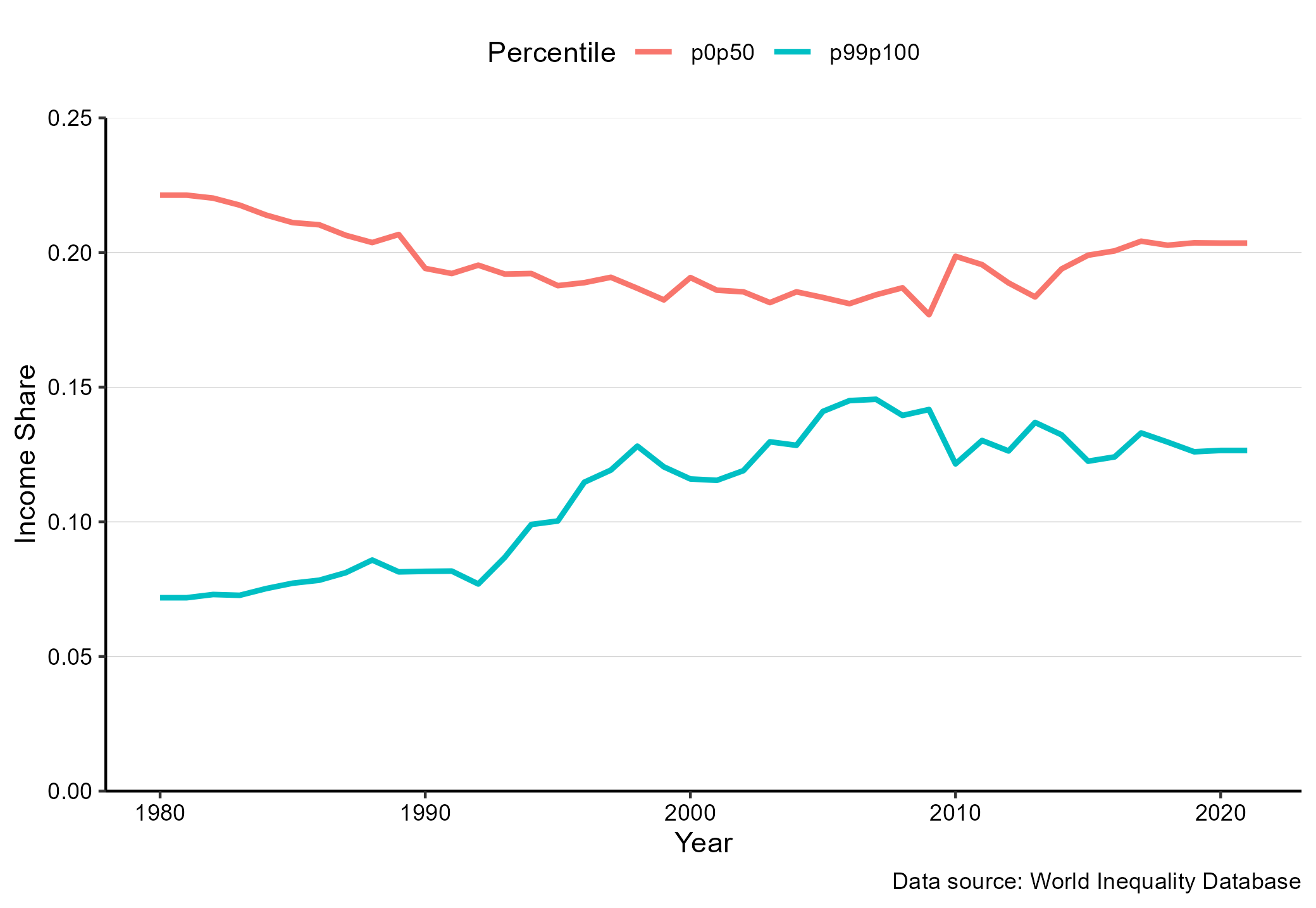
Figure 6.3: Income shares in the UK. Data source: World Inequality database
So what does this chart tell us? We can see that in the early 1980ies, the top 1 percent (the p99p100) had about seven percent of the total income in the UK. That is about 7 times more than their equal share. In 2012 that share was about 12 percent. The income share of the top 1 percent has increased and almost doubled over the last three decades.
Where did that increase in income for the top 1 percent come from? The red line in the chart shows the income share of the bottom 50 percent. This group had about 24 of the total income in the early 1980ies. That is about half of their equal share. Over the three decades their income share dropped by about 2.5 percentage points. Part of the increase in the top income share is therefore from the bottom 50 percent, but not everything.
We have now introduced already used our first measures of inequality:
- the income share of the top 1 percent.
- the income share of the bottom 50 percent.
6.5 The Lorenz curve and the Gini coefficient
So far, we have looked at specific parts of the income distribution. What about the other parts of the income distribution and their income shares? And can we combine all these income shares in one measure? Yes, that is what the Lorenz curve does.
One of the most common approaches to showing income distributions is the Lorenz-curve, developed by the American economist, Max Lorenz. The curve plots the share of total income relative to the position in the income distribution. So on the x-axis we rank the population by their income and on the y-axis we show the cumulative income share. Here is a cookbook for creating a Lorenz curve:
- Sort all households (individuals) by their income, from lowest to highest and give them a relative income rank.
- Compute the total income for the population.
- For each individual in the household calculate their share of total income.
- Calculate the cumulative income share by adding the individual shares. So for the household with the lowest income, the cumulative share is just their income share. For the second lowest income household, the cumulative income share is their share plus the share of the lowest income household.
- Create a line chart of the cumulative income shares against the household (individual) income rank.
In Figure 6.3 we already did steps 1 to 3. We now just need to calculate the cumulative share and draw a line. Let’s see how that looks. In 6.4 we’ve simply replaced the individual income shares with the cumulative shares. This is our first Lorenz Curve. We also added the 45 degree line. It shows how the line should look if income was perfectly equally distributed. We see that the actual line deviates considerably from the equal distribution. The size of the area between the two lines divided by the size of the triangle is known as the GINI coefficient. The larger the larger the deviation, the larger the GINI coefficient and the more unequal the income distributed.
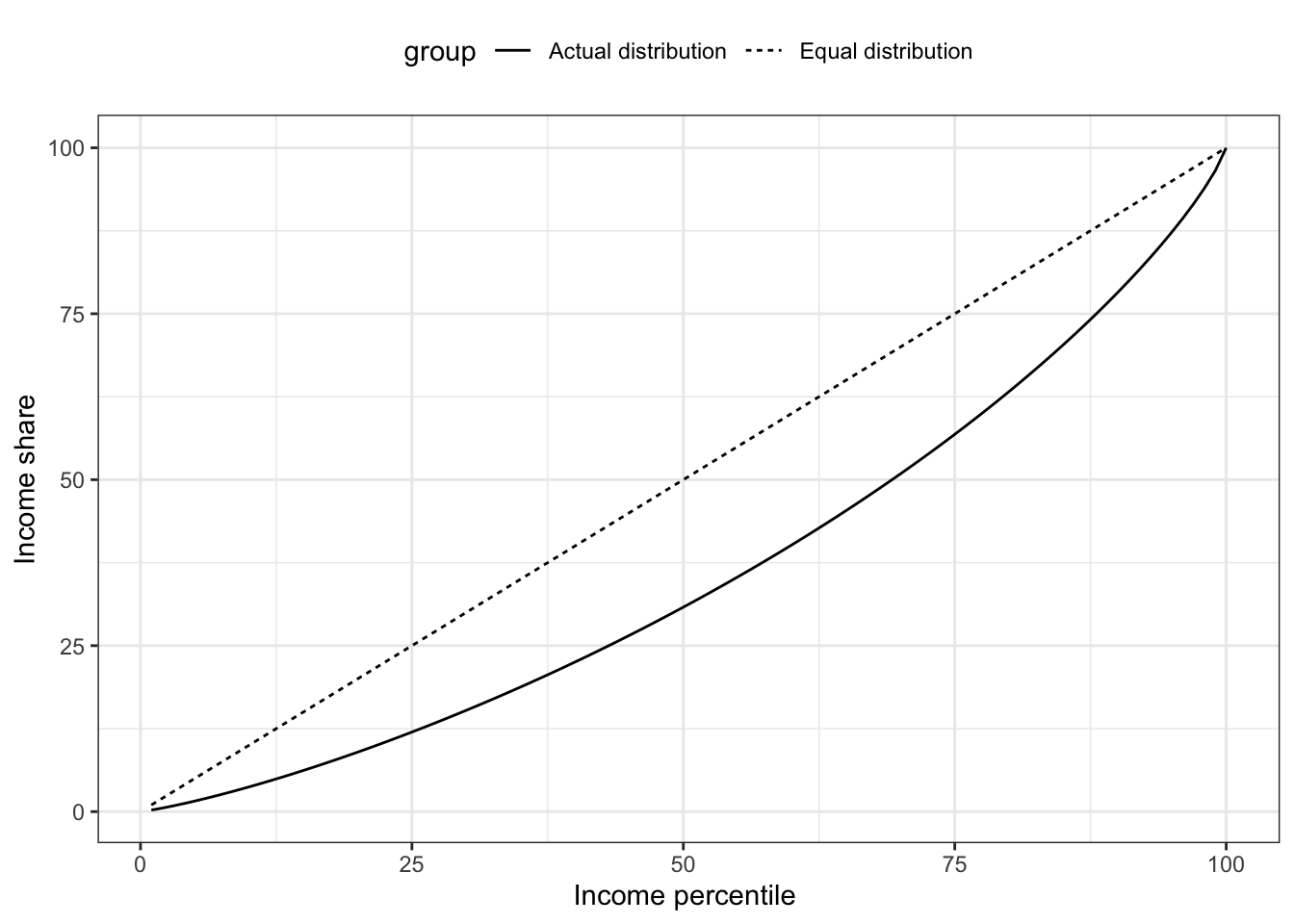
Figure 6.4: Income shares based on simulated data.
Let’s now consider a very simple example of an economy with 10 households as shown in Table 6.2. In scenario 1 all households have the same income. In scenario 2, one household has all income of the economy. In scenario 3 the income is gradually increasing.
| Household | Scenario 1 | Scenario 2 | Scenario 3 |
|---|---|---|---|
| 1 | 10 | 0 | 3 |
| 2 | 10 | 0 | 5 |
| 3 | 10 | 0 | 6 |
| 4 | 10 | 0 | 8 |
| 5 | 10 | 0 | 9 |
| 6 | 10 | 0 | 10 |
| 7 | 10 | 0 | 12 |
| 8 | 10 | 0 | 13 |
| 9 | 10 | 0 | 14 |
| 10 | 10 | 100 | 20 |
In situation 1, where every individual has the same share of the total income the Lorenz curve will be a straight line, the 45 degree line, as shown by the black line in Figure 6.5. While this situation is never seen in practice, this situation is important because it serves as a reference point for a completely equal income distribution.
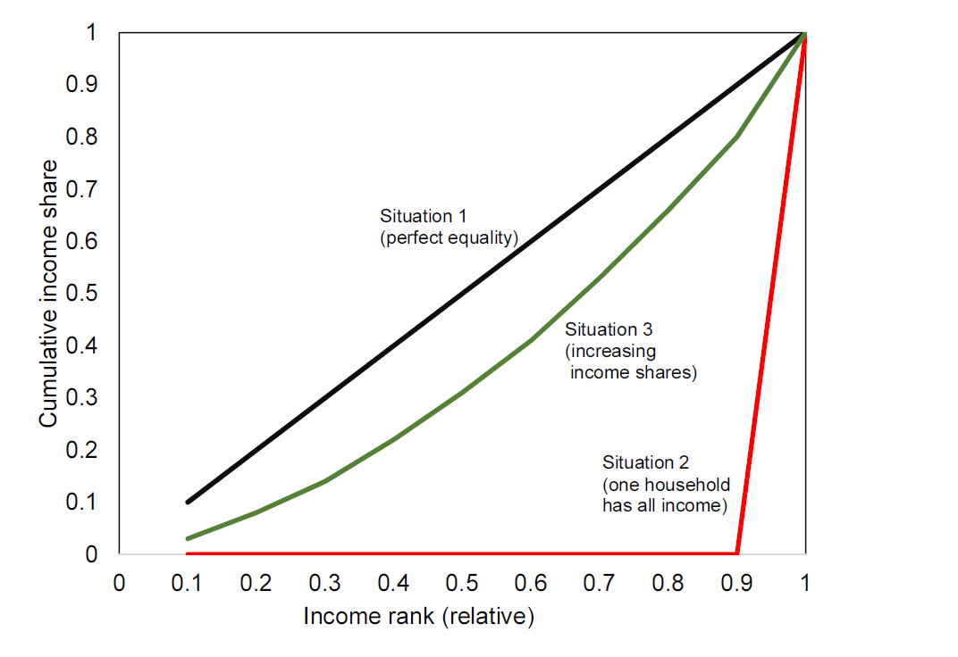
Figure 6.5: Lorenz curves for 3 different income distributions.
Situation 2 is the other extreme, where one household has 100 percent of the income, as shown in Figure @ref{fig:poverty0}. Finally, the green line in 6.5 shows situation 3, where every household has some income, but the income share is slowly increasing. Note from Table 6.2 that in Situation 3, the sixth household has the same income as in the perfectly equal situation. All households below (1-5) have a lower share than in the equal situation and all households above have a higher share.
Based on the Lorenz curve we can make statements on the income distribution, such as “the bottom 30 percent has 14 percent of the total income” or “the bottom 50 percent has 31 percent of the income” (Situation 3).
While the Lorenz curve provides a graphical representation of the income distribution, we are often interested in quantifying the income distribution in one number. This can be done by means of the Gini coefficient. We use the Lorenz-curve and situation 1 above as a point of departure to calculate the Gini coefficient.
The Gini coefficient
Note from the discussion above, that the 45 degree line represents a perfectly equal distribution. To quantify the degree of inequality we are interested in quantifying how far we are from that situation. One way to quantify this is by means of the area between the actual income distribution and the 45 degree line, corresponding to area A in Figure 6.6. The smaller this area is, the closer we are to the perfect equal distribution. We can then scale this area to the total area below the 45 degree line, which is area A and area B in Figure 6.6, and that is the Gini coefficient. The Gini coefficient will always be between 0 (perfectly equal) and 1 (perfectly unequal).
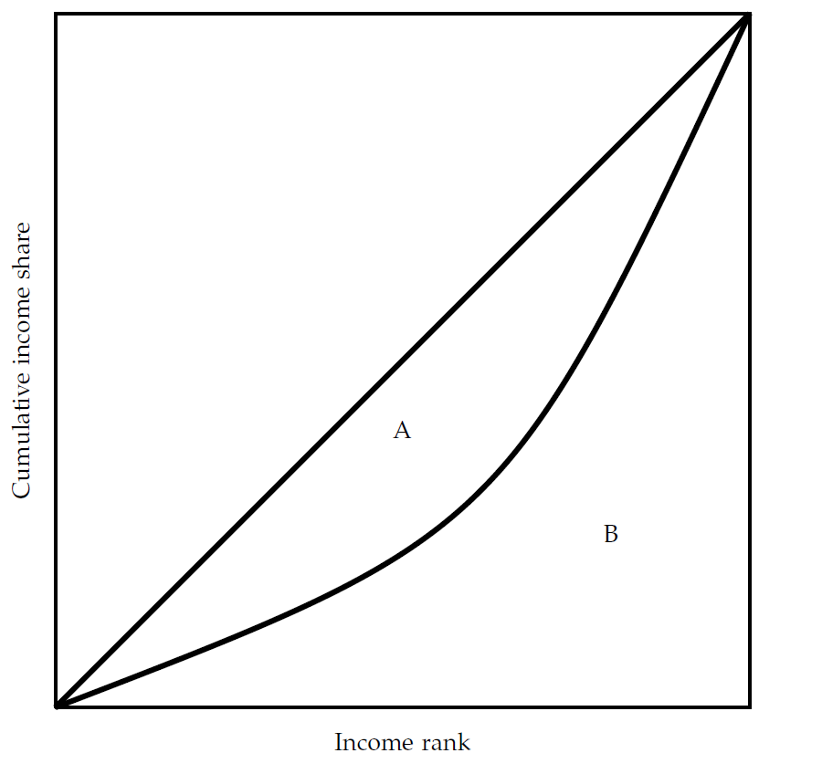
Figure 6.6: The Lorenz curve and the Gini coefficient. The Gini coefficient is \(A/(A+B)\).
Returning to the example above, how can we calculate the Gini coefficient? First note, that the curves in Figure 6.6 are not smooth as in Figure 6.6. In practice, it is discrete and not continuous. We can therefore approximate the areas by considering the difference between the 45 degree line and the actual income share for each household, as shown by the grey bars in Figure 6.7. We can then relate the sum of the area of these bars to the sum of the area of these bars and the orange bars in Figure 6.7 (corresponding to area B).
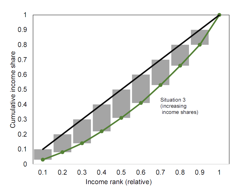
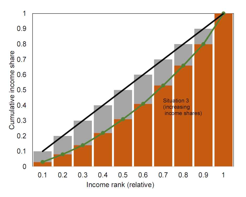
Figure 6.7: Approximating the Gini coefficient using the Lorenz curve Left: approximation of area A. Right: approximation of are B.
Table 6.3 shows how we can approximate areas A and B in the simple examples above to calculate the Gini coefficient. We simply use the approach illustrated in Figure 6.8. Each bar has a width of 0.1 which we multiply by the height of the bar.
| Scenario 2 | Scenario 3 | |||
|---|---|---|---|---|
| Decile | Income share (B) | A | Income share (B) | A |
| 1 | 0 | 0.1 | 0.03 | 0.07 |
| 2 | 0 | 0.2 | 0.08 | 0.12 |
| 3 | 0 | 0.3 | 0.14 | 0.16 |
| 4 | 0 | 0.4 | 0.22 | 0.18 |
| 5 | 0 | 0.5 | 0.31 | 0.19 |
| 6 | 0 | 0.6 | 0.41 | 0.19 |
| 7 | 0 | 0.7 | 0.53 | 0.17 |
| 8 | 0 | 0.8 | 0.66 | 0.14 |
| 9 | 0 | 0.9 | 0.8 | 0.1 |
| 10 | 1 | 0 | 1 | 0 |
| Sum | 1 | 4.5 | 4.18 | 1.32 |
| Gini | \(\frac{4.5}{1+4.5}=0.82\) | \(\frac{1.32}{1.32+4.18}=0.24\) |
In the case of the very unequal distribution of resources, we get a Gini coefficient of 0.82 (situation 2) and in the (more realistic) situation 3, we get a Gini coefficient of 0.24. So how do these Gini coefficients correspond to real world Gini coefficients? Figure 6.8 shows a bar chart of Gini coefficients for European countries in 2016. According to Eurostat, the UK had a Gini coefficient of 0.315 in 2016. Serbia had a Gini coefficient of 0.386 and Slovakia a coefficient of 0.243. The simple “realistic” example (situation 3) is therefore not far from what we observe in the real world.
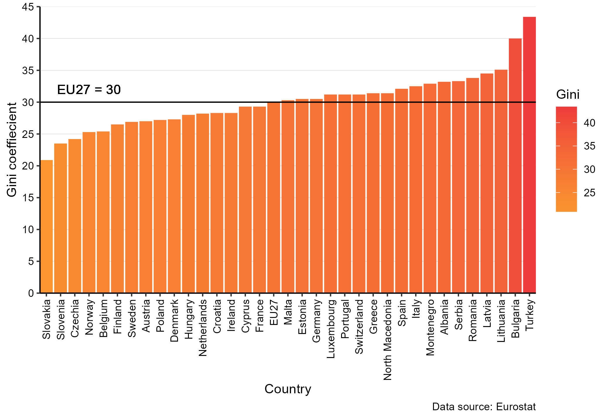
Figure 6.8: Gini coefficients in 2016 for European countries. Source: Eurostat.
Can we generalize our “Gini” approximation above to obtain a formula? First, note that both the x and y axis go from 0 to 1, the area of A+B will therefore always be 0.5 (\(1\times 1\times 0.5=0.5\)), we can therefore write:
\[\begin{align} Gini&=A/(A+B)\nonumber\\ &=A/0.5\nonumber\\ &=1-2B \end{align}\]
where we simply used that since \(A+B=0.5\) we have that \(A=0.5-B\). Now we just need to find the area \(B\). First, let us define household \(i's\) income (or wealth) be \(y_i\), where we have sorted all households according to their income (or wealth) rank. The first household (the one with the lowest income or wealth) will have the following contribution to the area B:
\[\begin{align} b_1=\frac{y_1}{\sum_i^ny_i} \end{align}\]
the second household will contribute with the following value:
\[\begin{align} b_2=\frac{y_1+y_2}{\sum_i^ny_i} \end{align}\]
finally, we sum over all these households to get:
\[\begin{align} B=&\frac{1}{n}\frac{y_1}{\sum_i^ny_i}+\frac{1}{n}\frac{y_1+y_2}{\sum_i^ny_i}+\dots+\frac{1}{n}\frac{y_1+y_2+\dots+y_n}{\sum_i^ny_i}\nonumber\\ B=&\frac{1}{n}\frac{y_1+y_1+y_2+\dots y_1+y_2+\dots+y_n}{\sum_i^ny_i}\nonumber\\ B=&\frac{1}{n}\frac{ny_1+(n-1)y_2+\dots+y_n}{\sum_i^ny_i}\nonumber\\ B=&\frac{1}{n}\frac{\sum_i^n(n-i+1)y_i}{\sum_i^ny_i}\nonumber\\ \end{align}\]
which we can insert in the expression for \(Gini\) above to get an expression for the approximate Gini coefficient:
\[\begin{align} Gini&=1-\frac{2}{n}\frac{\sum_i^n(n-i+1)y_i}{\sum_i^ny_i}\nonumber \end{align}\]
It is important to note that the formula is an approximation based on the bar chart approach. It will work well as long as the number of bars is sufficiently large. There are many formulas for the Gini coefficient. The above is simple and straightforward, but there are other formulas that give more precise estimates. This formula tends to overestimate area B, because we are approximating the area using the height at the right end of the bars (a small improvement is simply to use the average of the height of the bar and the height of the lagged bar).
What is good about the Gini coefficient? First of all, the Gini coefficient is just one number, and it is thus easy to compare across countries and time. Secondly, it satisfies a number of key principles: (A) it is independent of a of a country’s size and the currency used, (B) if a rich a household transfers money to a poor household the Gini will be reduced and (C) it is anonymous (it does not say anything about who the poorest and richest households are).
Is the Gini coefficient a perfect measure of inequality? No! Institutional settings differ considerably. How health care in a country is financed will affect the inequality. If all health care is privately funded, it will take out a large share of low income households, and a relatively low share of high income households. On the other hand, if health care is financed by a progressive income tax this will not be the case.
Another issue with the Gini coefficient is that it depends on the quality of the data. If it is only calculated based on deciles (as above) it will be considerably less precise than if it is calculated based on thousands of observations.
6.6 Other measures of inequality
The Gini coefficient is by far the most popular measure of inequality. The data is available across time and areas for many different countries. However, as mentioned above, it is not perfect and there are alternative measures. Let’s briefly discuss a few: