13 Data visualization basics
13.1 What this chapter is about
This chapter provides a brief introduction to good data visualization. We first go through an example to illustrate that “How we show data matters”. We then describe principles for producing good data visualizations. The chapter is inspired by the following resources on data visualization.
13.2 How we show data matters
Illustration: The Anscombe quartet
Once we’ve obtained the data we can start working with the data. A crucial principle in working with data is the simple principle represented by a famous quote by Edward Tufte: “Above All Else Show the Data”. To illustrate why showing the data, and how we show the data is important, we can use an example from Edward Tufte’s book, known as the Anscombe’s quartet (Francis John Anscombe was an English statistician).37 Consider the four datasets shown in Table 13.1, what do you learn from this table (X1 and Y1 are one dataset, X2 and Y2 are another dataset, and so on)? Hard to say?
It is difficult to tell anything about these datasets based on a table. This is one of the downsides of a table. A table is very useful for showing precise numbers, but once there are too many numbers we start to lose the overview (this table has 88 numbers!).
| Dataset 1 | Dataset 2 | Dataset 3 | Dataset 4 | ||||
|---|---|---|---|---|---|---|---|
| X1 | Y1 | X2 | Y2 | X3 | Y3 | X4 | Y4 |
| 10.00 | 8.04 | 10.00 | 9.14 | 10.00 | 7.46 | 8.00 | 6.58 |
| 8.00 | 6.95 | 8.00 | 8.14 | 8.00 | 6.77 | 8.00 | 5.76 |
| 13.00 | 7.58 | 13.00 | 8.74 | 13.00 | 12.74 | 8.00 | 7.71 |
| 9.00 | 8.81 | 9.00 | 8.77 | 9.00 | 7.11 | 8.00 | 8.84 |
| 11.00 | 8.33 | 11.00 | 9.26 | 11.00 | 7.81 | 8.00 | 8.47 |
| 14.00 | 9.96 | 14.00 | 8.10 | 14.00 | 8.84 | 8.00 | 7.04 |
| 6.00 | 7.24 | 6.00 | 6.13 | 6.00 | 6.08 | 8.00 | 5.25 |
| 4.00 | 4.26 | 4.00 | 3.10 | 4.00 | 5.39 | 19.00 | 12.50 |
| 12.00 | 10.84 | 12.00 | 9.13 | 12.00 | 8.15 | 8.00 | 5.56 |
| 7.00 | 4.82 | 7.00 | 7.26 | 7.00 | 6.42 | 8.00 | 7.91 |
| 5.00 | 5.68 | 5.00 | 4.74 | 5.00 | 5.73 | 8.00 | 6.89 |
There are a few things we could do to improve the readability of Table 13.1, for example sort all series by their x values, but it would still be difficult to identify the patterns in the data. Another strategy is to calculate some simple statistics for these four datasets, and include them in a Table. Table 13.2 shows the arithmetic mean for every variable, the Pearson correlation coefficient between each X and Y variable, the slope and the intercept and the R-squared of the fitted regression line. These statistics all look very similar across the four datasets. Note how important the way we show the data is. If we had only seen Table 13.2 we would be inclined to conclude that these four datasets are very similar. If we had only seen Table 13.1, we would probably conclude that the datasets are quite different.
| Dataset 1 | Dataset 2 | Dataset 3 | Dataset 4 | ||||
|---|---|---|---|---|---|---|---|
| X1 | Y1 | X2 | Y2 | X3 | Y3 | X4 | Y4 |
| Mean | 9.0 | 7.5 | 9.0 | 7.5 | 9.0 | 7.5 | 9.0 |
| Pearson’s r | 0.82 | 0.82 | 0.82 | 0.82 | |||
| Regression line (OLS) | |||||||
| Intercept | 3.00 | 3.00 | 3.00 | 3.00 | |||
| Slope | 0.50 | 0.50 | 0.50 | 0.50 | |||
| R\(^{2}\) | 0.67 | 0.67 | 0.67 | 0.67 |
Finally, let’s look at the data using charts. Figure 13.1 shows the same four datasets by means of scatterplots. By means of these scatterplots you immediately see the difference between the four datasets. We also note that the fitted line is the same in the four datasets (as suggested by the coefficients in Table 13.2, although the underlying relationship between the Y and the X variables are very different.
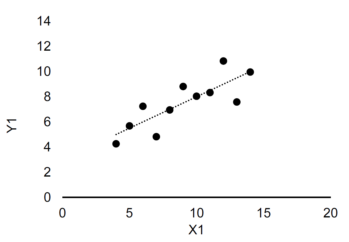
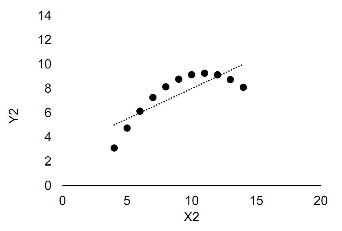
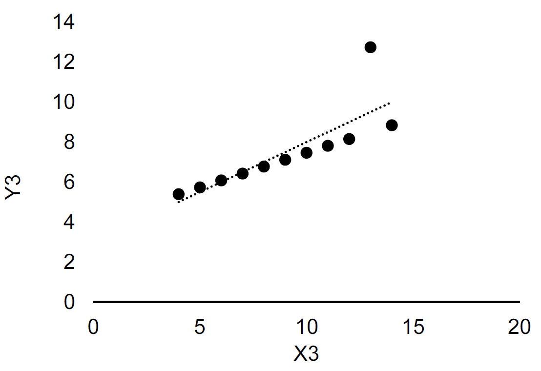
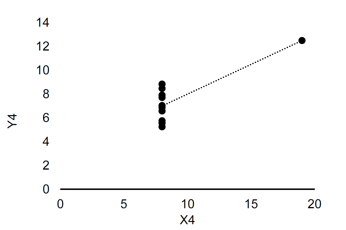
Figure 13.1: scatterplots of Anscombe’s quartet. The dashed line is fitted using Ordinary Least Squares. Upper left: Dataset 1. Upper right: Dataset 2. Lower left: Dataset 3. Lower right: Dataset 4.
The takeaway from this example is that the way we represent data is important. It is not always the most complicated or advanced method that is the best. In this example, presenting regression coefficients and several moments of the data would give the misleading message that the four datasets are very similar, when in fact they are very different. So let us consider some simple rules for visualizing data.
13.3 Tables vs charts
The goal of the visualization
So we know that how we show data matters, and that the objective of the optimal data visualization method depends on the purpose of the visualization. Let us now start thinking about how we would like to show our data. At this point it is useful to take a step back and think about the how graphs and tables work:
- A chart typically contains at least one axis, the *\textbf{ values are represented in terms of visual objects (dots, lines, areas, bars) and axes typically have scales or labels.
- A table on the other hand typically contains rows and columns, and the values are represented by text.
Because tables use text to represent values, showing thousands of values implies that the reader is expected to read thousands of values and remember how they relate to each other, and their exact values. This is clearly not optimal. It is a quite demanding task. On the other hand, if we use a chart, the reader has to read visual aspects such as the position of objects, the size of objects, or the colour of objects. This is somewhat easier with thousands of observations, compared to a chart. For example, if we move from left to right on the horizontal axes, are the objects positioned further up or further down on the vertical axis.
Therefore, if we are only interested in whether observations are similar (i.e. the pattern) graphs are more efficient. However, if you want the exact value of an observation graphs do not work well. It is hard to infer the exact value based on shapes, colours and positions.
There are many ways to visualize data, and providing principles and rules for each visualization approach would not be very useful (and not very valid). Instead, we will provide some principles for groups of visualization methods. The first two groups we will consider (and the most important distinction): are tables and graphs. In the Anscombe example above, a graph was clearly a better way to visualize data if the goal was to understand the pattern in the data. However, if we instead were interested in comparing the means across the four datasets, Table 13.2 would clearly be ideal. It is very hard to read the means from the graphs in Figure 13.1. So the first decision rule is as follows:
- If we are interested in exploring, analyzing or communicating patterns in the data, charts are more useful than tables.
- If we are interested exploring, analyzing or communicating specific numbers in the data, tables are more useful than graphs. In other words, if we want to look up a specific value or compare values, a table is more useful than a graph.
In general a table is very useful if we want to show a few very precise numbers (i.e. decimal points). A table also has the advantage of being able to combine several different types of values (for example the statistics for the Anscombe example in Week 1).
The quantity of data
We might not a-priori know whether we are more interested in patterns or specific values. Consider the four datasets in the Anscombe example. We are simply interested in comparing these datasets. The reason Table 13.2 works poorly is that we are overloaded with information: eight columns with ten observations of values = eighty values. Comparing all these eighty values to each other takes time and is cognitively demanding, so this way of presenting data is not ideal.
- charts are typically more useful than tables in situations with many data points.
13.4 Table design
In some cases we might have large tables with a lot of numbers that work well. Figure 13.2 shows an example of a (famous) large table that works well.
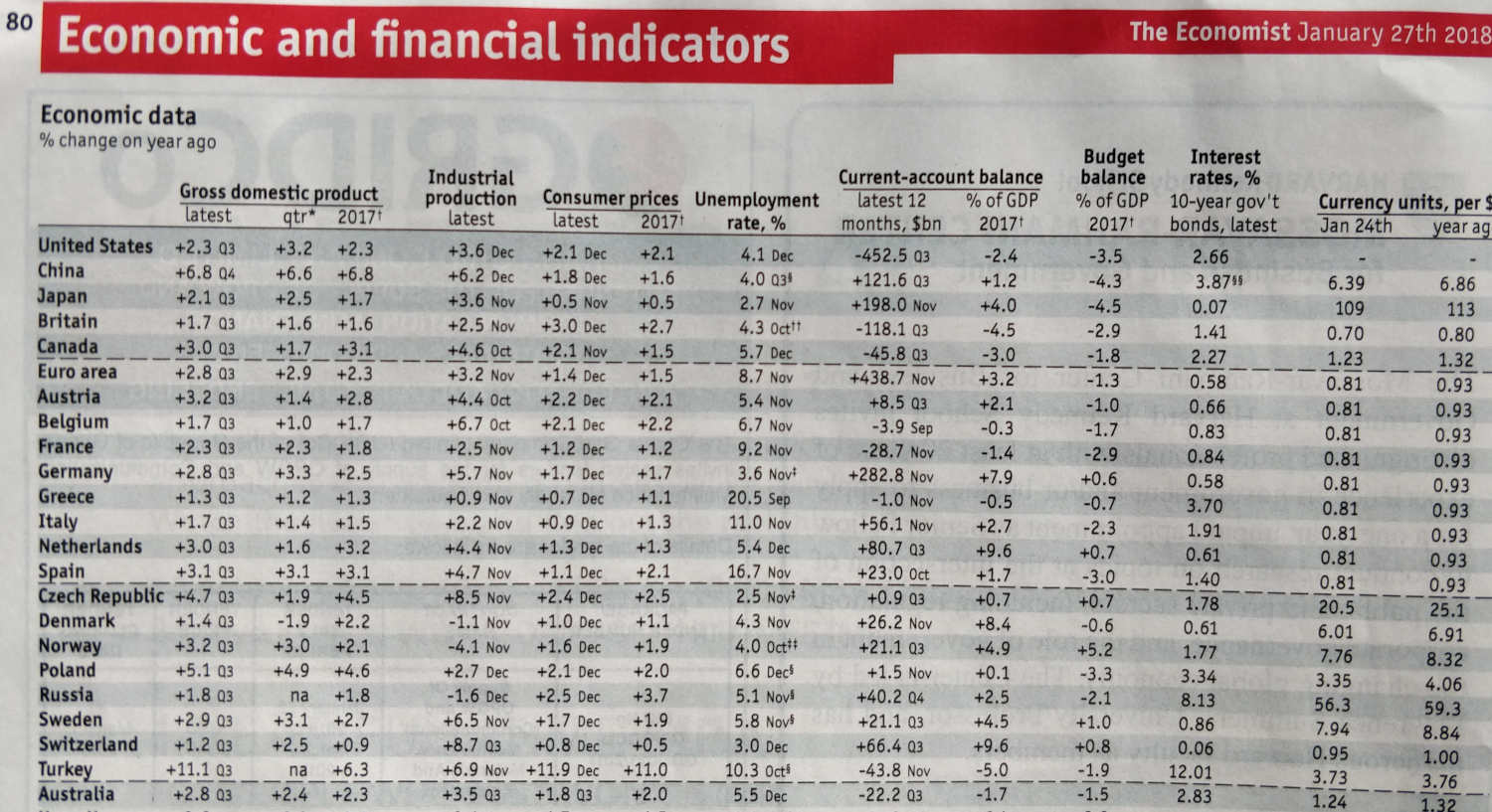
Figure 13.2: An example of a table from the magazine ‘The Economist’
So why does Figure 13.2 work well? Because we use it to look up numbers, it uses good table design and it clearly directs the reader to specific information. We will return to the issue of table and graph design below. The main takeaway here is that when choosing between a table and a graph it is worth considering the amount of data to visualize and whether the purpose of the visualization is to visualize patterns or specific values.
Table structure
A table is organized in rows and columns. While the table representation therefore by definition is two dimensional, the table can be highly complex. At least one of the dimensions is typically numerical. The other dimension(s) might be categorical or also numerical.
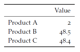
Figure 13.3: A table with a categorical variable in rows and a numerical variable in columns
The table shown in Figure 13.3 is an example of a table where we have a categorical variable (products) and a numerical variable (value). We could easily add another categorical dimension to the table, by showing the value for different areas as in the table shown in Figure 13.4 , where we have product (categorical), area (categorical) and value (numerical).
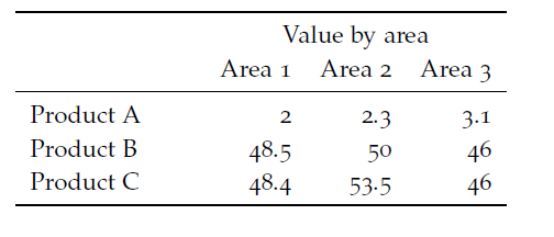
Figure 13.4: A table with one numerical variable and two categorical variables
We can make the table slightly more complex by adding another hierarchical dimension. In other words there is some specific ordering of the categorical variables: “A 2.2” is a sub-area of “Area 2”. We cannot just move “A 2.1” to “Area 1”. A hierarchical table structure gives insights into “conditionals”: For example, what is the average wage for a bus driver, conditional on being a woman?
Figure 13.5: A table with a hierarchical structure.
Tables can be outlined in different ways to optimize space and readability. In a unidirectional approach categorical values are organized along one dimension. In a bidirectional table, categorical values are organized along both rows and columns. The table shown in Figure @(fig:viz7) is a bidirectional table. We have Product categories down the rows and areas across columns. This layout saves is slightly more space and ink efficient. Can you redesign the same table to be bidirectional? Why is the table not as efficient in terms of space and ink?
To summarize, when designing a table it is worth first considering the dimensions in the data you would like to show. How many dimensions are there? Are they structured in hierarchical order? Figure @(fig:viz8) provides two table examples. The tables represent the same underlying data. One of them is doing a good job, the other not. Why not?
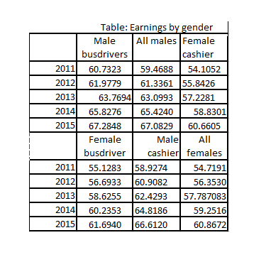
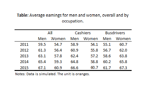
Figure 13.6: A poorly designed and structured table and a table with a good structure and layout.
Table layout and design
It is clearly not only the structure that makes one of the tables in @(fig:viz8) good and the other one bad. The table on the left is clearly also better designed. Once we have organized our table in rows and columns, there are a number of layout features that you can adjust to improve the readability of the table. Below is a short list of design aspect to consider when designing a table.
Columns and rows can be separated using lines, white space and colours. These approaches can also be used to group and highlight observations.
When formatting text we should carefully consider the alignment, font type, and orientation. For example, a column with quantitative values of varying widths (i.e. varying number of digits) will be difficult to read if it is centered (right alignment is much easier to read ).
Values that summarize other values in the table should be distinct (by font, lines, colours, etc.).
Tables that span several pages should repeat titles, and column and row headers on each page.
13.5 Chart design
Basic chart structure
While tables are organized in columns and rows, charts are typically organized in two to three axes. Most graphs have two axes: a horizontal axis (the x-axis) and a vertical axis (the y-axis). The number of data dimensions (i.e. variables) shown in a chart is limited by the number of axes. With only two axes the graph can only represent two variables. The variable shown on the y-axis (for example unemployment) and the value shown on the x-values (for example time measured in quarters).
As charts often visualize large quantities of information, it is therefore important to prioritize clarity and simplicity. Graphs with a third “depth” axis (z-axis) are therefore still relatively rare least in popular media. However, graphs with a second vertical axis (typically on the right) are not uncommon.
How charts work
As described, charts use visual objects to represent values. But not all charts use the same tool to visualize values. Generally speaking, we can divide the chart into two types by how they visualize values:
Values are represented by their position relative to the axes. Popular examples are line charts and scatterplots.
Values are represented by the size of an area: Popular examples are bar charts and area charts. A popular example that you typically should avoid is a pie chart (more on that later).
Values are represented by the colour or shape/symbol: Popular examples are scatterplots, where observations related to the same group use the same symbol. In all chart types, we use colours and shapes to group the data.
Values are continuous \(\rightarrow\) use chart type that visually connects elements, for example a line chart.
Values are categorical \(\rightarrow\) use chart type that visually separates elements, for example a bar chart.
Why is this important to think about how charts (and tables) work? First of all, when using a specific chart type it is important to know how this type of chart represents values in the chart design. Cutting the y-axes for a bar chart is therefore in principle often a poor idea, because the bar chart uses the size of the area to show the value of the variable. Secondly, when selecting a graph type it is important to think about how the values are represented.
Common chart types
There are my graph types that use combinations of the methods described above (position of symbols, shapes and areas) to visualize data. We will not cover all graph types, but focus on some general guiding principles. We will return to many of these graphs later on in the unit. But for now, we will focus on four common graph types. Figure 13.7 shows a bar chart of the most popular data representation methods based on a small survey of three editions of the magazine The Economist. The Figure shows that line charts are used in almost every second data representation in these editions of The Economists.
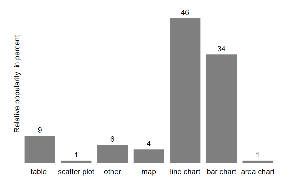
Figure 13.7: Data representations in ‘The Economist’. Data source: Own survey of three volumes of The Economist.
The line chart
Why are line charts so popular? Let us first describe the line chart (for the case with two values): * The vertical position of the line represents the y-value. * The horizontal position of the line represents the x-value. * The line chart connects the visual elements and thereby provides an impression of a continuous change. * (i.e. meaningful if there could be values between these points) * The line chart is typically used to show the relationship between two numerical variables. * The line chart is typically read from left to right, and gives the reader an interpretation of development.
The two last points are crucial. Connecting two categorical groups rarely makes any sense. Figure 13.8 for example, shows the values used in 13.7 using a line chart. With a line chart, we are naturally inclined to look at the change, from left to right, and less likely to focus on the group comparison (as with a bar chart). As there is no obvious ordering of the groups on the x-axis, the interpretation of a decline, from left-to-right is meaningless. In other words, a line chart is a powerful message if we want to illustrate a continuous change, for example over time).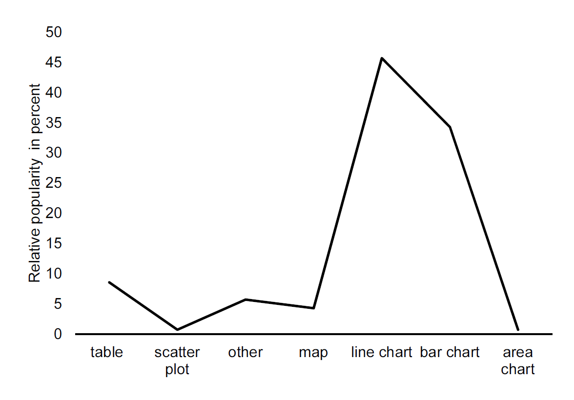
Figure 13.8: Data representations in ‘The Economist’ using a line chart. Data source: Own survey of three volumes of The Economist.
The bar chart
Let us now consider the second most popular chart type, the bar chart. Let us make the same list we created for the line chart for the bar chart:
- represents the data value by means of a separated graphical element.
- can be used for categorical variables, because the values are not connected and clearly distinct.
- y-axis should, whenever possible, start at zero (or other logical reference levels).
- can be shown both vertically and horizontally.
- can show several data series for the same categorical variable.
Maps
Showing data in maps can provide new insights and reveal patterns. For example that cholera deaths are clustered around pumps like in the map created by John Snow, as shown in Figure 13.9.38

Figure 13.9: John Snow’s map of Cholera deaths in central London. Each line represents a death.Each circle represents a water pump. Source: Wikipedia.
How do we show data on maps?
- Dot-density maps, where each observation (a cholera death) is indicated by a dot (or similar marker). \(\Rightarrow\) higher density of pubs \(=\) higher frequency.
- Choropleth maps, where data is aggregated to geographic areas with specific boundaries (often administrative units such as countries, regions, and counties). The value is shown by the colour of the unit.
- Combining standard chart types with maps. For example bar charts are placed on maps.
Charts to avoid
Unfortunately, there exists a wide range of non-functional charts that are widely used. Chapter 12 in39 provides a good discussion of charts that “are best forsaken”:
Pie charts
Donut charts and pie charts are very popular chart types, but they are very often inefficient ways of fractions. First of all, these charts should only be used when showing “part-of-a-whole”. Secondly, while donut charts and pie charts are “cute”, they are very inefficient, especially when we want to compare the size of the pie (or donut) pieces to each other or to pieces in other donuts.
Charts with 3D effects
3D effects are very popular, but as general advice: charts should never have more dimensions than the dimensions in the data. If you have two dimensions in your data, your chart should be two dimensional. If you have three dimensions in your data, the chart could potentially have 3 dimensions. 3D charts based on 3 variables are fascinating, but it can be challenging to interpret them.
So should you completely avoid all charts listed in chapter 12 of40 ? There is no chart police (yet), but the point of this discussion is that several chart types are inefficient and they often can be replaced by simple line or bar charts. This might seem boring and you might want to use various chart types to keep the readers’ attention, but remember the point by Cairo: They should be functional
13.6 Lies, junk and non-data ink.
Tufte’s concepts for good data visualizations.
In his seminal work on data visualizations Edward Tufte introduced a number of concepts for good (or bad) data visualizations. We will here briefly discuss the most important ones.
The Lie Factor
Recall above that charts use visual tools to represent the value of the data point. But what if we make the bar in a bar chart slightly larger than it is supposed to be according to the value it represents? We are then distorting the visualization and misleading the reader. We can quantify the size of this lie by means of the Lie Factor.41 \[\begin{align} \text{Lie Factor}=\frac{\text{size of effect shown in graphic}}{\text{size of effect in data}} \end{align}\]
According to Tufte, Lie Factors below 0.95 or above 1.05 are signs of substantial distortion, that cannot be attributed to inaccuracies in the production of the chart.
Data-ink ratio
Edward R. Tufte’s quote “Above All Else Show the Data”42 focuses on what we should show: the data. But the quote also implicitly hints at what we should not show (“above all else”): the non-data part. We can quantify what we show in terms of the “ink” used (if it was printed on paper), and our objective should be to maximize the amount of data we show relative to the amount of ink we use. This concept, and the idea of the data-ink ratio can also be attributed to Tufte. We can formally think of the data-ink ratio as follows:43
\[\begin{align} \text{Data-ink Ratio}=\frac{\text{data-ink}}{\text{total ink used to print the graphic}} \end{align}\]
We should aim at maximizing this ratio. In other words we should maximize the amount of data we show relative to the amount of ink (or attention) we use. While we rarely will use this equation literally, it is a very useful concept to have in mind when designing graphs and tables. A very approachable way to work with this concept is given by,44 who suggests that we always conduct the following steps (my personal rewriting of the steps):
- Reduce the ink that is not related to data.
- Remove unnecessary non-data ink.
- De-emphasize the remaining data ink
- Enhance the ink that is directly related to data.
- Remove unnecessary non-data ink.
- Emphasize the most important data ink.
Let’s try this in practice. Figure 13.10 shows a bar chart that does a poor job of communicating the data.
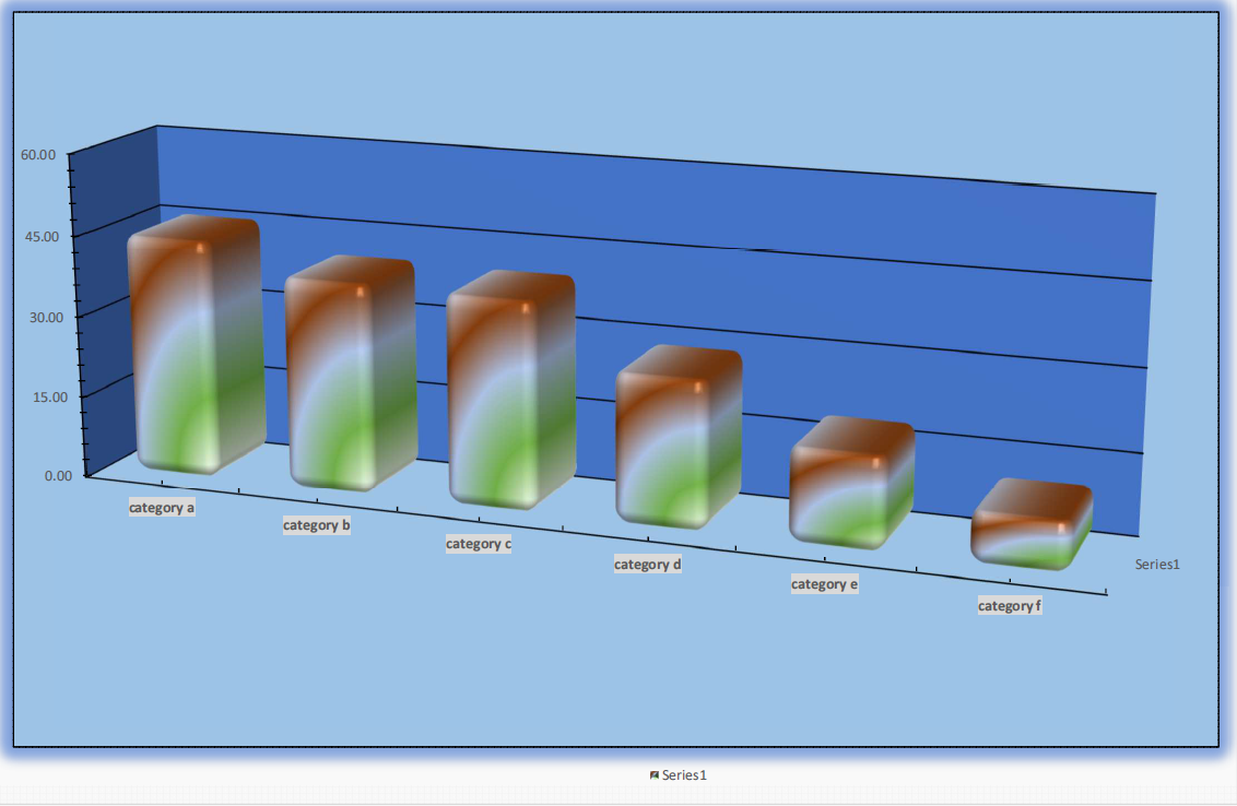
Figure 13.10: A bar chart with a low data ink ratio
Let’s follow the instructions above to improve the chart in Figure 13.10 by removing unnecessary non-data ink. We removed the background and borders. This is unnecessary ink that has nothing to do with the data. This gives us the chart shown in Figure 13.11.
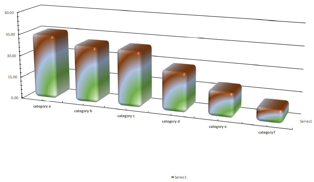
Figure 13.11: The bar chart after removing the background and borders.
Removing the background already improved the data-ink ratio, but there is scope for more. We can also remove the 3D effect. This is unnecessary ink that has nothing to do with the data, and only makes the chart more difficult to read. We can also remove the glow and filling effects. The resulting chart is shown in Figure 13.12.
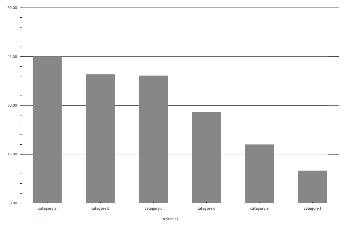
Figure 13.12: The bar chart after removing the 3D effects.
Compare Figure 13.12 to Figure 13.10. The data-ink ratio is clearly improved. But there is scope for more. We can also remove the grid lines and the legend. Grid lines and tick marks can sometimes be helpful, but in this case I think they can be removed. We only show one data series here, so there is no need to show a legend explaining what refers to what.
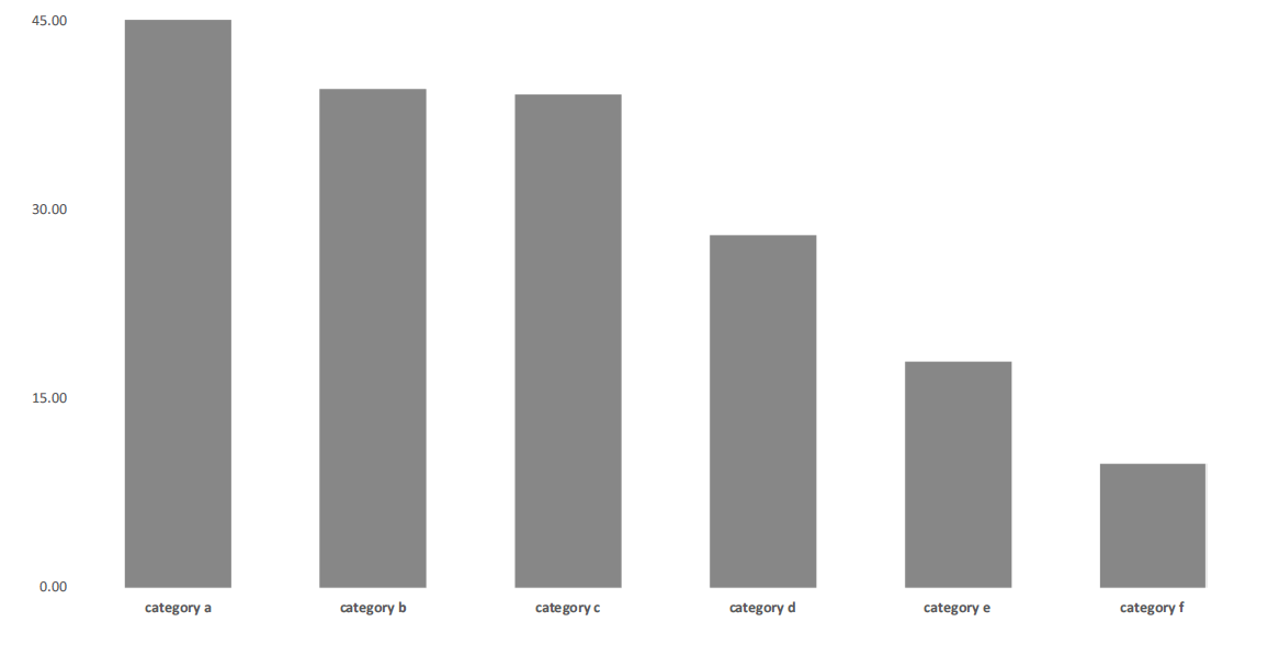
Figure 13.13: The bar chart after removing the grid lines and the legend.
The visualisation in Figure 13.13 is already fairly good, but we can improve the data-ink ratio by following the second steps and ” Enhance the ink that is directly related to data.”. We enhance the data by adding value labels. And because all the non-data ink is now removed. We can also increase the font size and thereby the readability of the actual data. We also added an axis title (“Unit”) as this is part of the data. The “final” chart is shown in Figure 13.14.
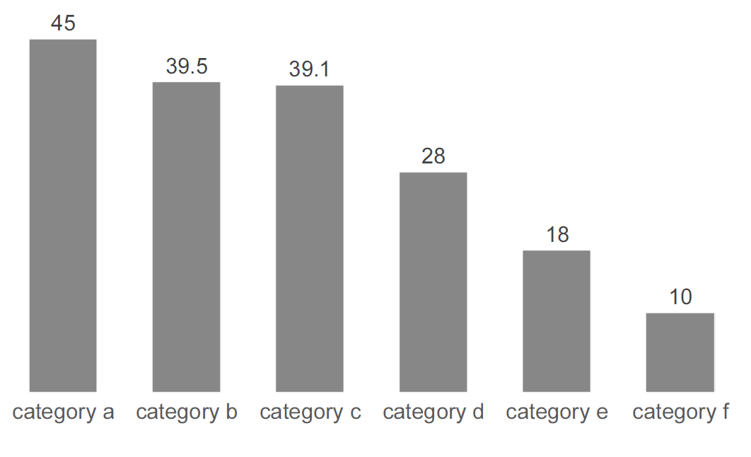
Figure 13.14: The bar chart after emphasizing the data.
Compare Figure 13.10 to Figure 13.14 we quickly realize how much easier it is to learn what the data says in the latter chart. It might look more boring (I admit, Figure 13.10 was quite ugly), but it is much more efficient. The chart is, however, not self-explanatory. Can you identify what is missing?
Chartjunk
Chartjunk captures all elements of a chart that are unrelated to the data information provided by the chart. By maximizing the data-ink ratio we can often minimize chart-junk. However, not all chartjunk is bad. In fact, in some (rare) examples chartjunk improves the readability of the chart and makes it more memorable.
One of the most common examples of chart-junk is when the author includes graphical elements related to the topic of the chart: “If the chart is about students, then we want the chart to consist of students.” or “If the chart is about childbirths, let us include babies in the graph”. This very rarely works well. Charts are first and foremost meant to communicate quantitative information.
Alberto Cairo’s principles of good data visualizations
The graphical journalist Alberto Cairo provides an excellent “summary” of what characterizes great data visualization. This summary is based on the book “The Truthful Art” by Alberto Cairo.45 The summary consists of five qualities that great data visualization should satisfy. Great visualizations are:
Truthful The visualization is not based on fabricated data or manipulated data work.
Functional The visualization allows the reader to get a meaningful understanding of the data.
Beautiful The visualization is aesthetically enjoyable.
Insightful The visualization provides new evidence.
Enlightening The visualization affects how the reader thinks about the specific topic or relationship.
13.7 The self-explanatory data visualization
Tables and charts should always be self-explanatory. Self-explanatory simply means that no explanation, beyond what is given in the chart or table is necessary to understand the visualisation.
- Chart and table titles: The title should explain what the data visualization shows.
- Axes titles: Clearly describe what is shown on the axes (unless it is self-explanatory, such as dates).
- Axes units: Clearly describe the measurement units used.
- Legends/column headers: Clearly describe what each variable captures.
- Source: Where does the data come from.
13.8 A cookbook for good data visualizations
We can summarize the principles for good data visualization using a “cookbook” type instructions.
A cookbook for good data visualization
-
Table or chart
- Charts are typically more effective for large datasets.
- Charts are typically preferred for visualizing patterns and tables are often the best choice for showing exact values.
-
Table structure/chart types
- How many variables are we showing?
- Charts are typically limited to two or three variables.
- Are the variables continuous or categorical?
- Avoid “connected” chart types if variables are categorical.
- How many variables are we showing?
-
Maximize data-ink ratio and avoid lies
- Tables: pay attention to the use of white space, solid lines, text alignment etc.
- Chart: Remove everything in the chart that is not related to the data and is not needed to understand the chart.
-
Self-explanatory
- Does the visualization contain everything needed to understand and replicate the chart?
- Are all axes clearly labelled? Is the source clearly stated?
13.9 Summary
In this chapter we covered some basics for good data visualization by going through the following topics
- How we show data matters.
- Tables and charts
- Table structure and layout
- Chart types and layout
- The self-explanatory visualization.
- A cookbook for a good data visualization.