4 Creating Charts in Microsoft Excel
4.1 Our first line chart
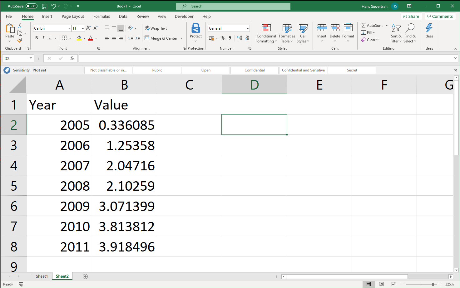
Let’s create our first chart in Microsoft Excel. We have a worksheet with two columns of data. Column A contains the variable Year and column B contains the variable Value. We want to create a chart where Year is shown on the horisontal axis and the variable Value on the vertical axis.
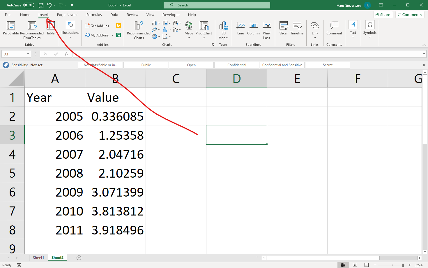
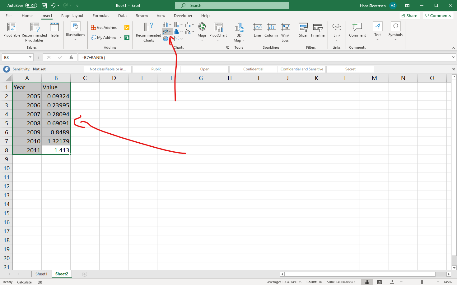
To insert a chart we select the Insert Tab.
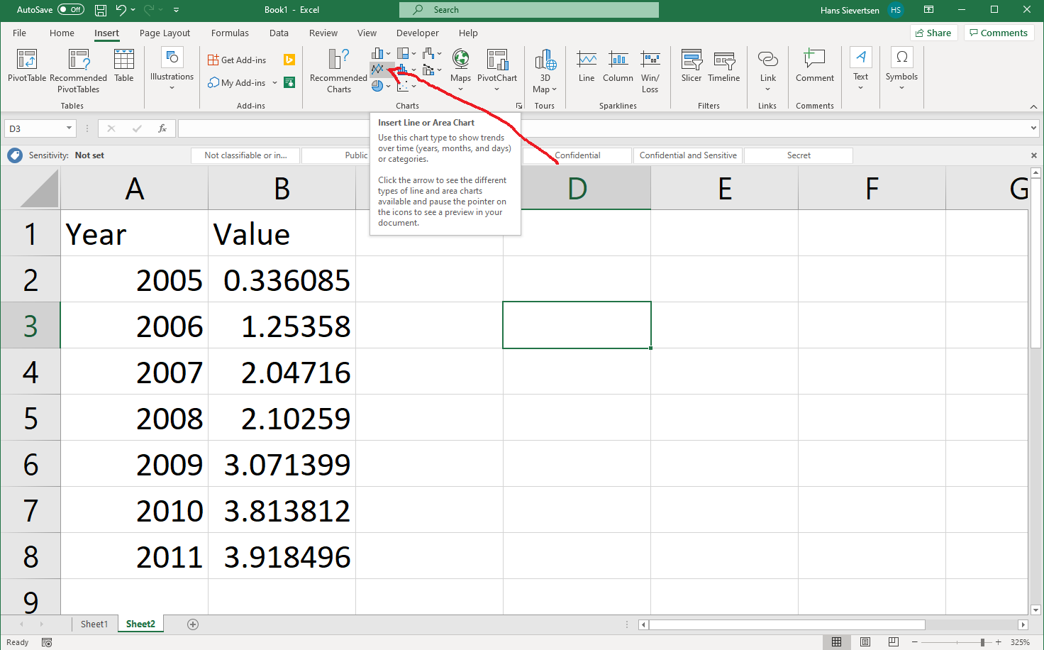
The Insert ribbon contains a section of charts. The icons reveal what type of chart they represent, but we can also hoover the mouse over the icon to see an explanation.
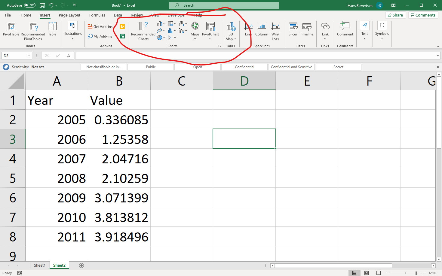
Let’s click on the icon that represents a line chart (see arrow below).
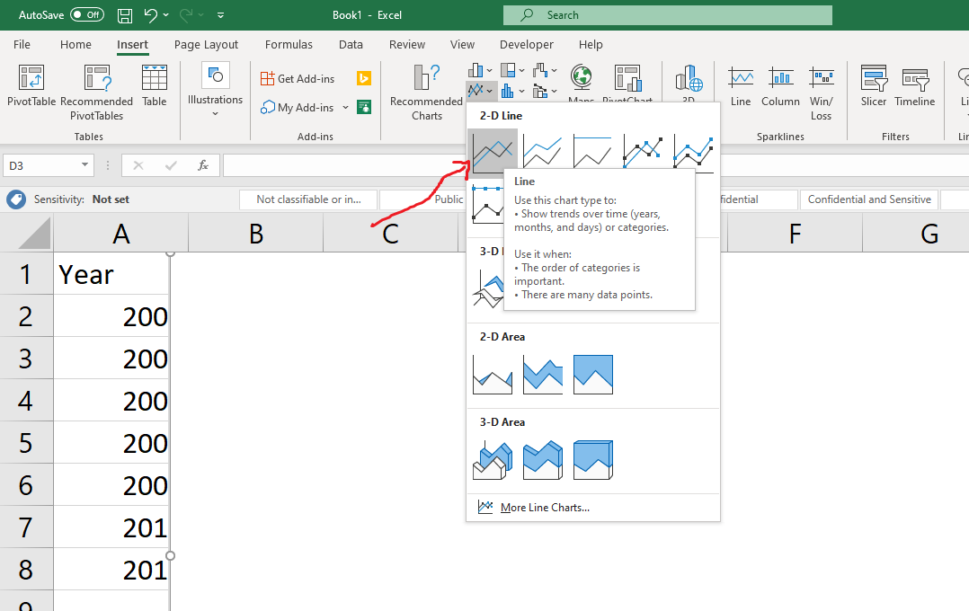
Clicking on the line chart icon opens a menu with different chart type options.
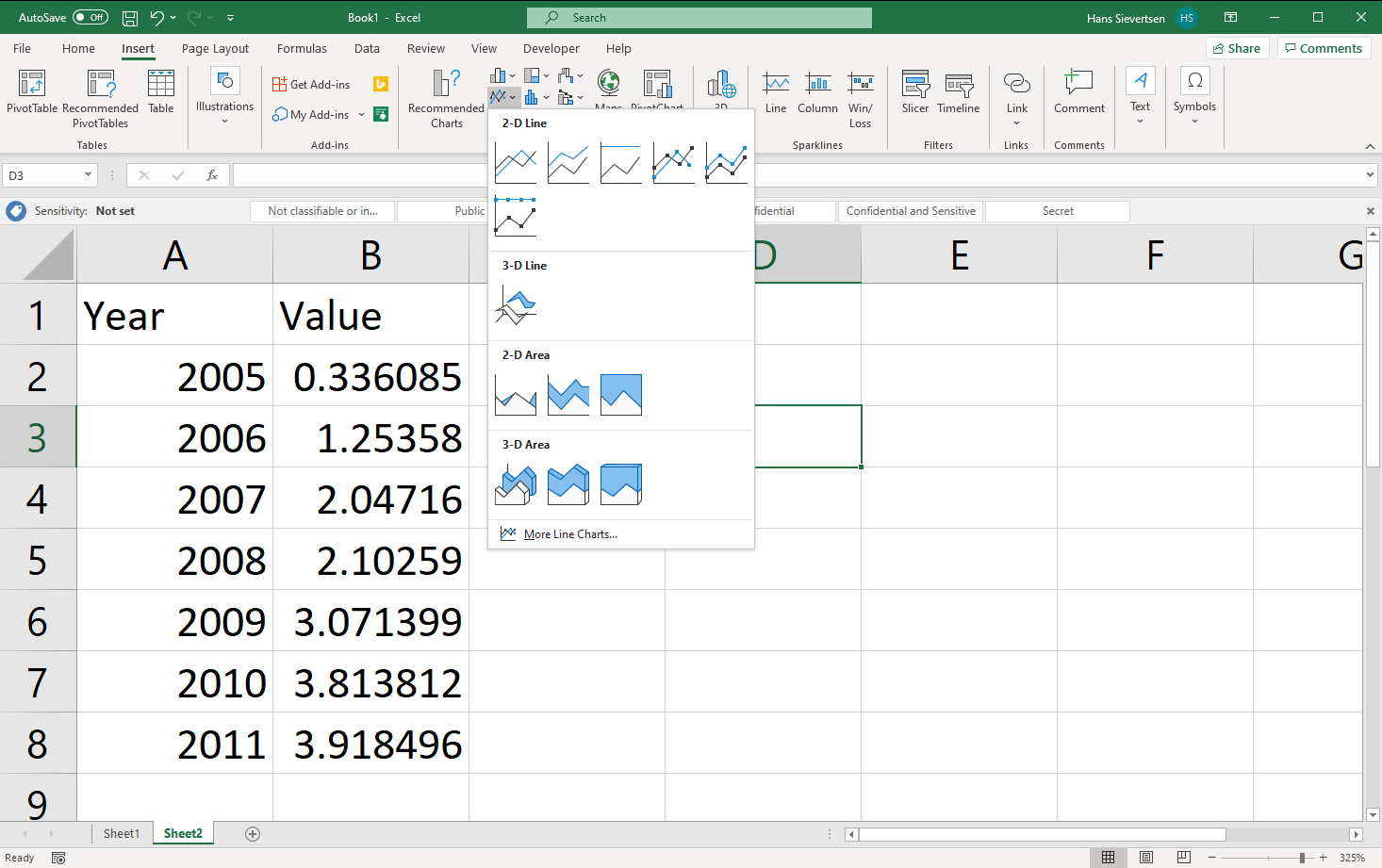
For now we’ll just pick the one in the upper left corner.
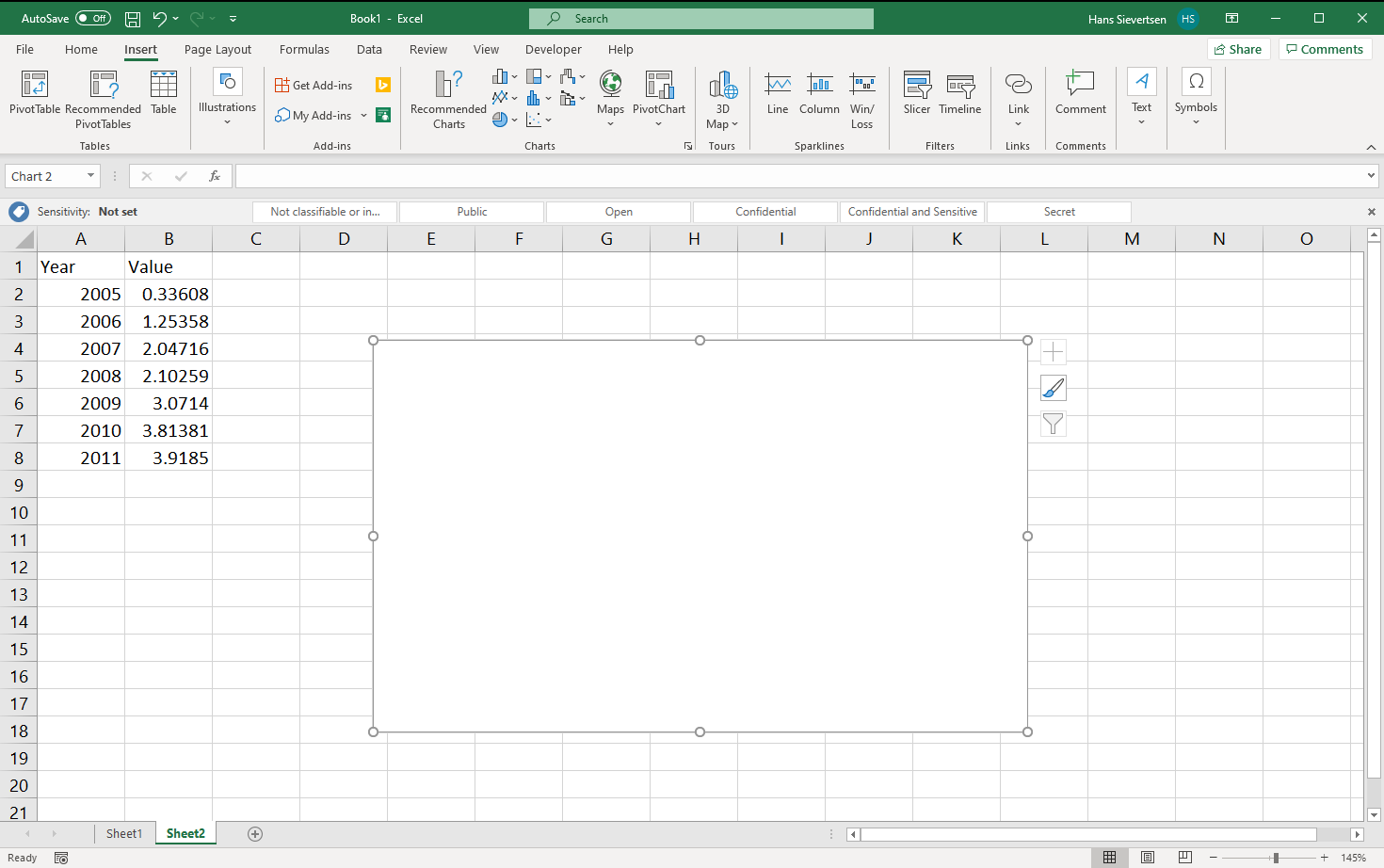
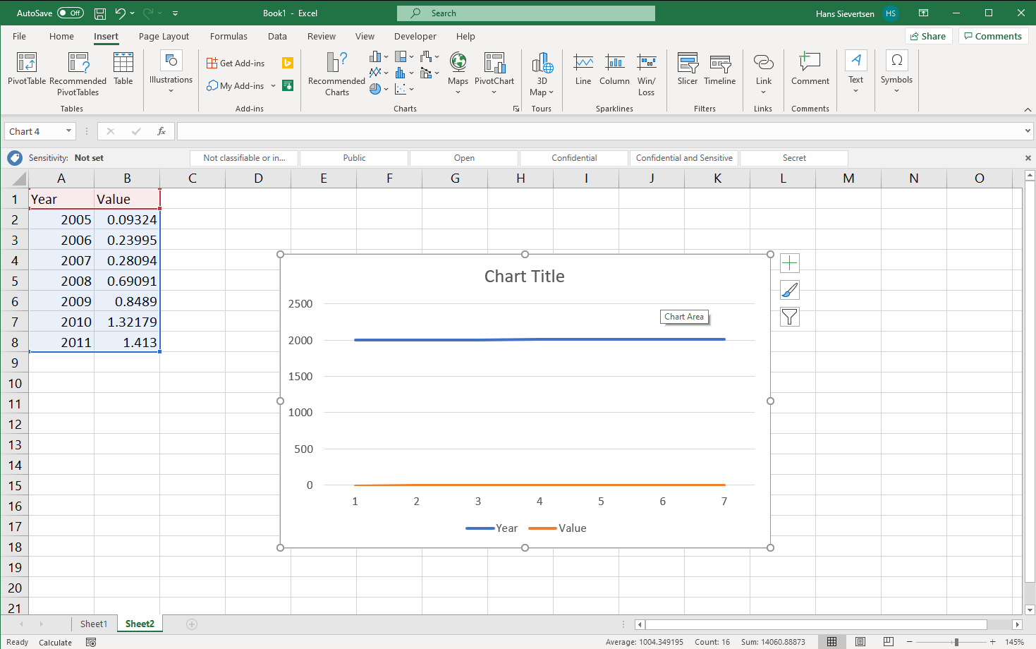
This creates a blank a canvas. Note if it doesn’t look like that for you,, it might be because Microsoft Excel guessed what data to include. We cover that case later. Just read-on for now!
We first need to tell Microsoft Excel what data to use for the chart. Once we’ve selected the chart canvas (just click on it), we can select the “Chart Design” tab and select “Select Data” (see below). Alternatively, we can just right-click on the canvas and click “Select Data”.
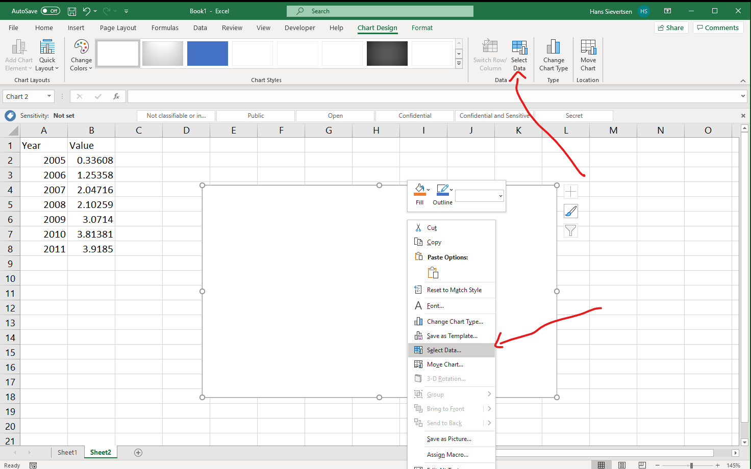
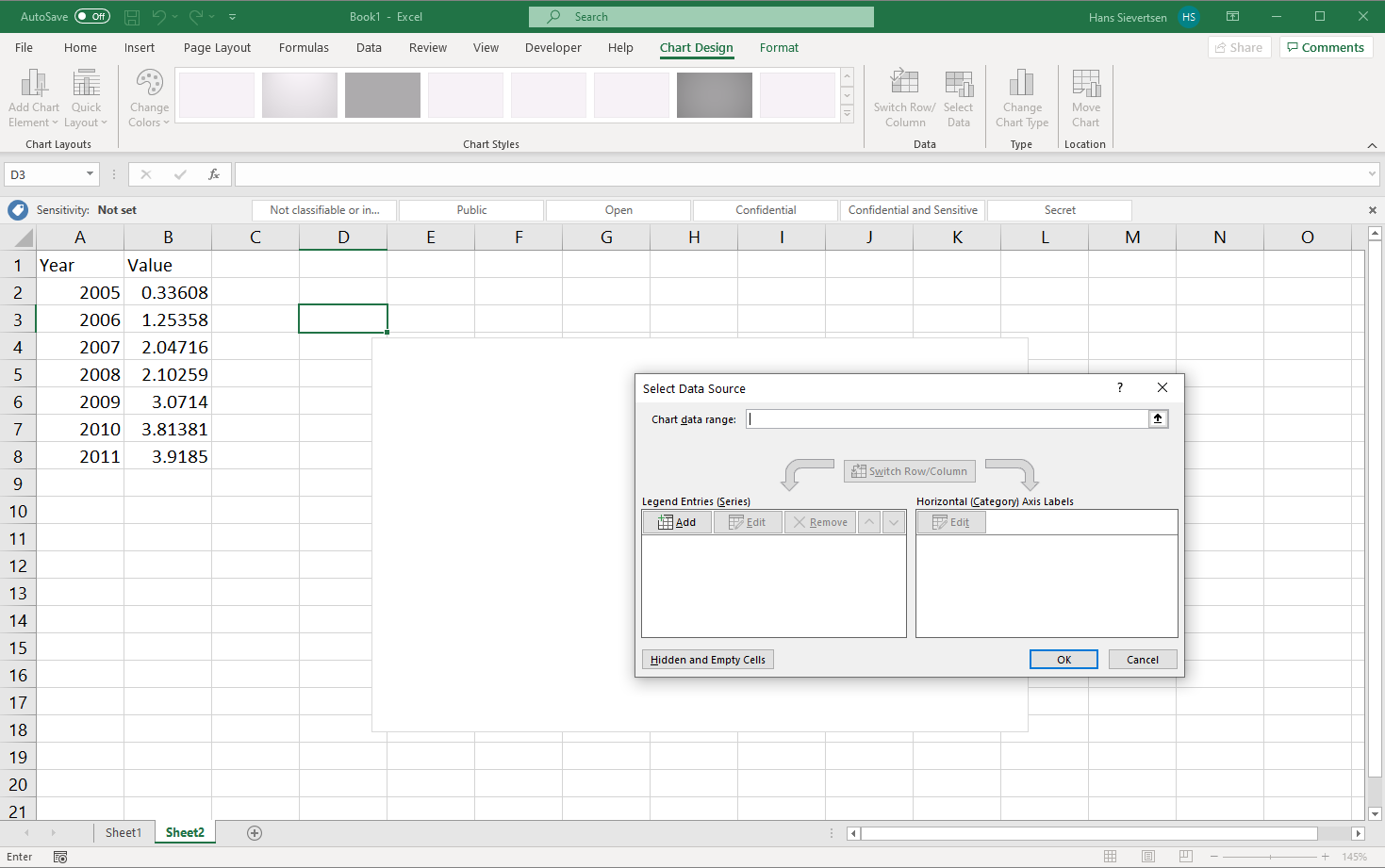
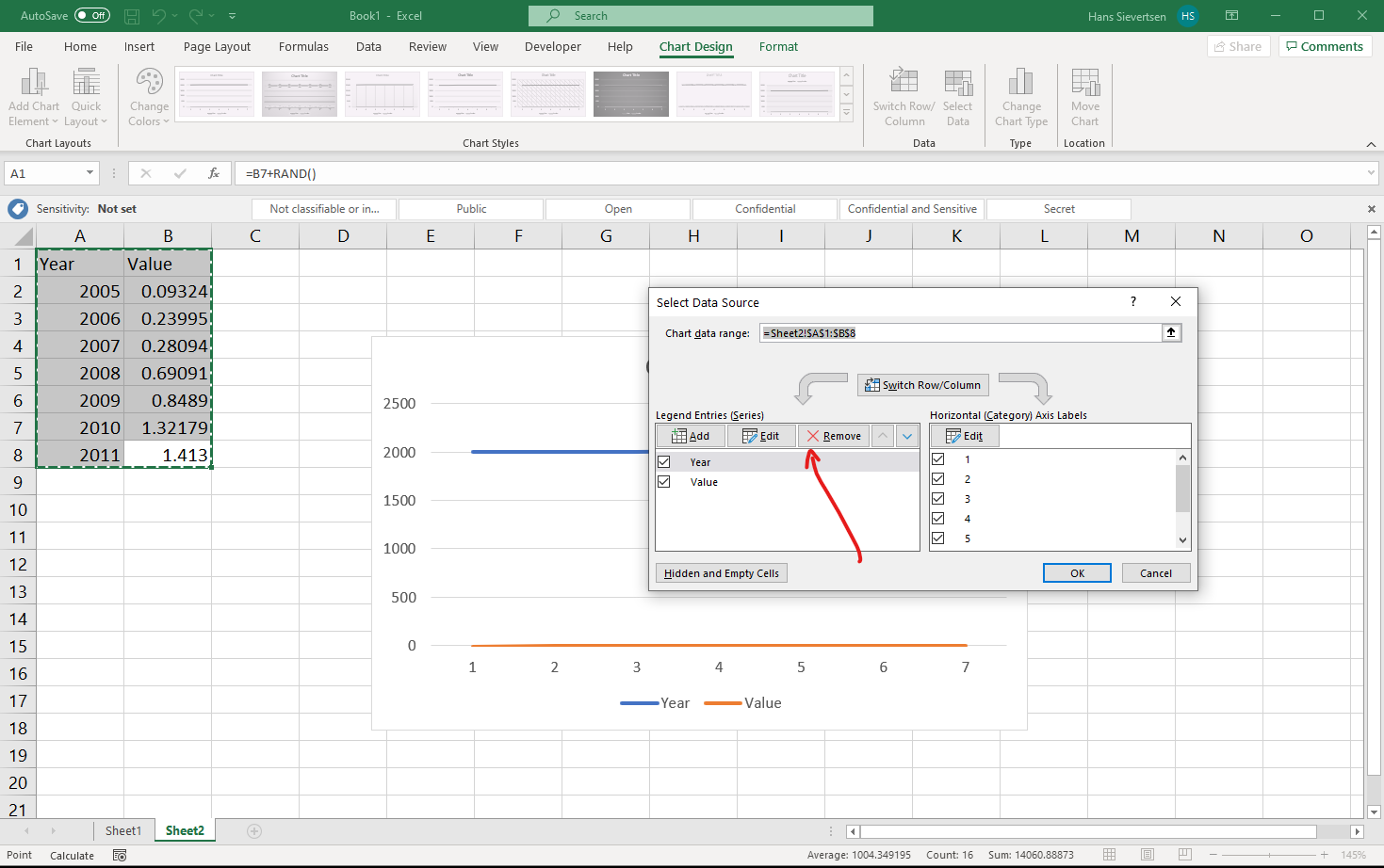
The select data looks like the menu below. In the top we can select the entire data range to be included. I generally recommend NOT to do that. Instead let’s focus on the two panels below. Here we can select the data to show on the vertical axis (y-axis) in the left panel, and the variable to show on the horisontal axis (x-axis) on the right panel.
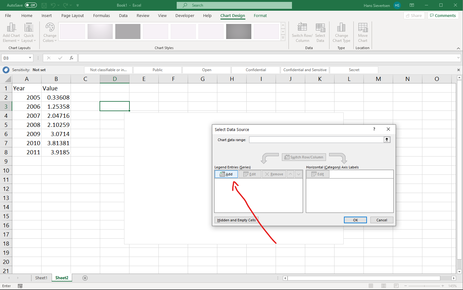
Let’s first tell Microsoft Excel what data to use for the vertical axis. We click “Add” as shown below.
We should now see a menu like the one below. Here we can add a name for the series and the content of the series.
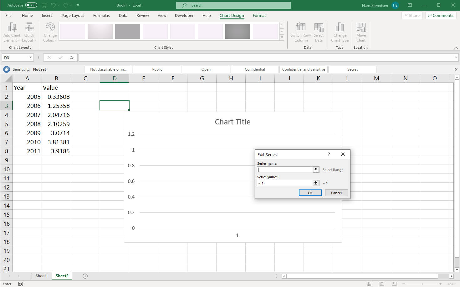
We can add the title of the series in “Series name” manually by simply typing it, or…
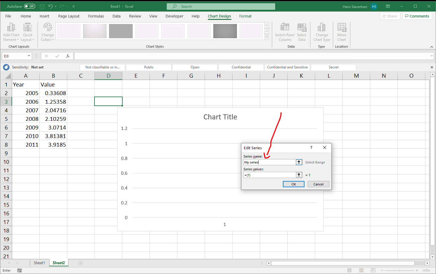
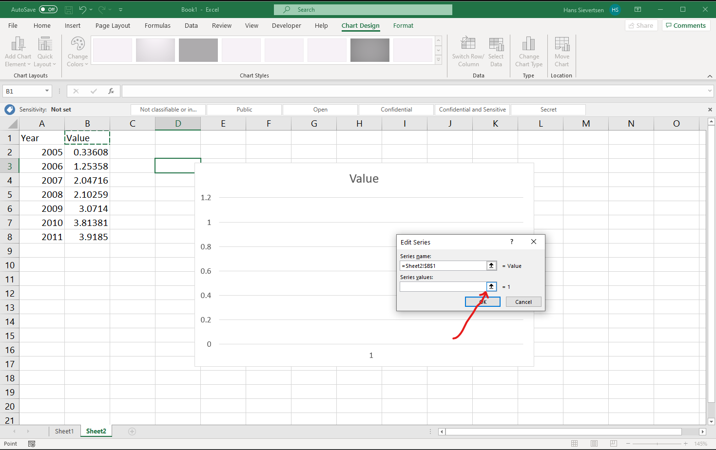
… we can click on the small icon with the arrow up as shown below.
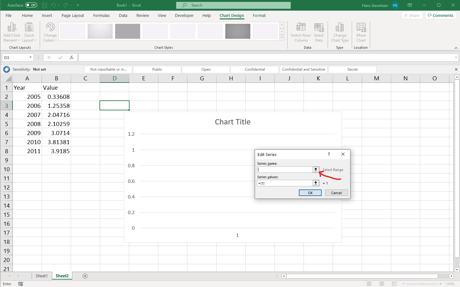
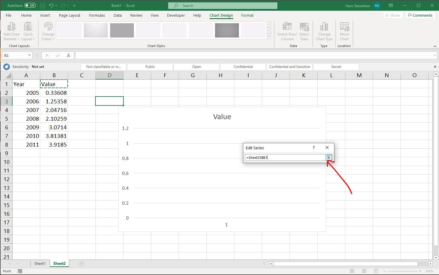
This opens yet another menu. We can now simply click on the cell that contains the title of the series or we can type the reference to the series like in the example below. The cell that is referenced should be marked with a dashed border. Click on the little icon indicated with the arrow below to confirm the selection.
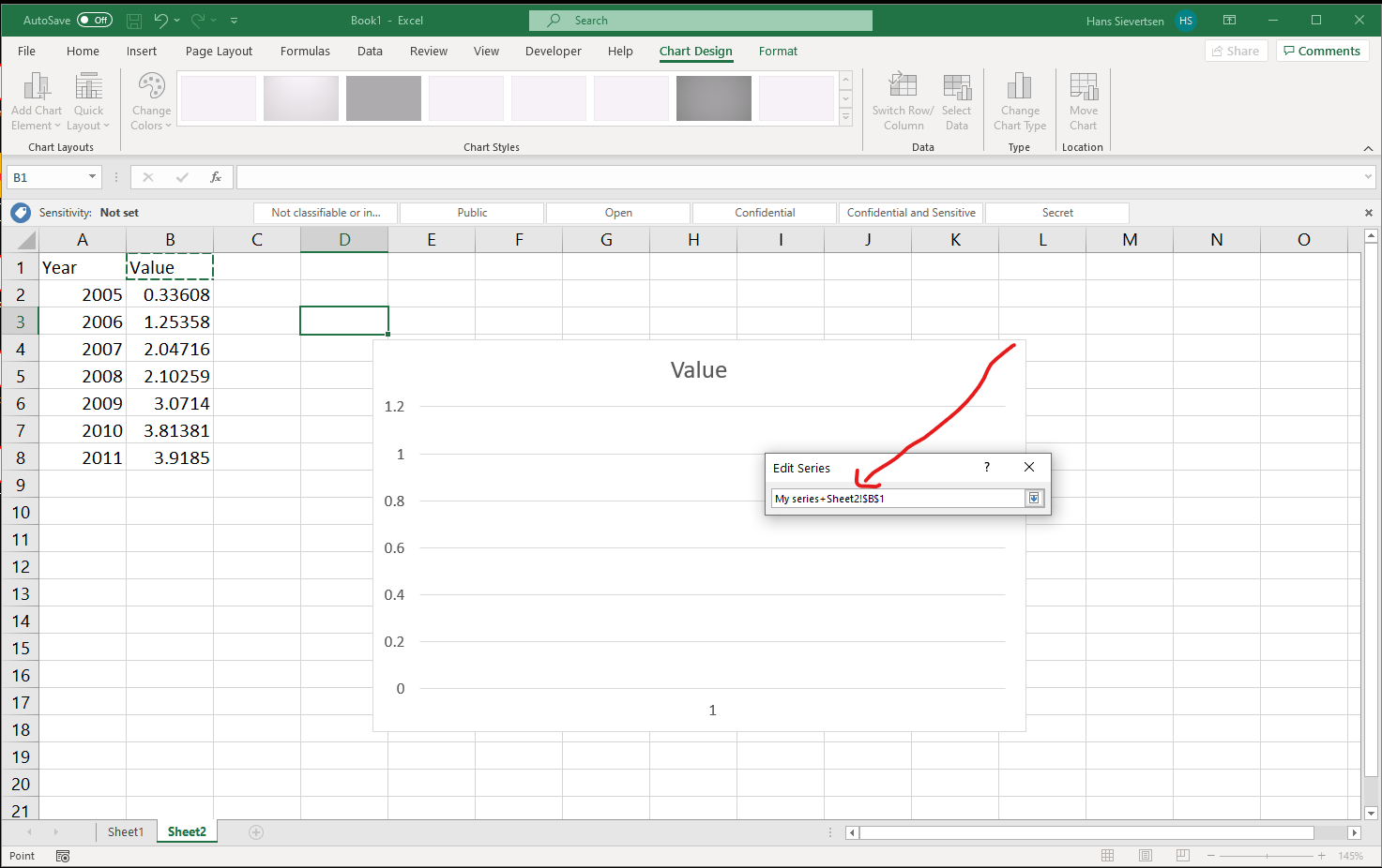
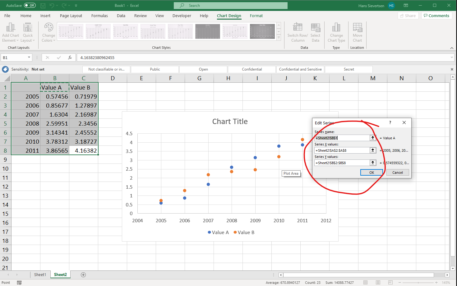
Note that it is very easy to mess up the reference to the right cell. For example as in the image below where I accidentially mixed-up a manual title entry with a reference to cell B1. Pay attention to what is written in the box!
We are now back at the menu. Now click on the arrow up symbol for the “Series Values” section (just like we did for the “Series Name”).
We now select all the cells that contain the values to show on the vertical axis and confirm our selection just like we did for the name.
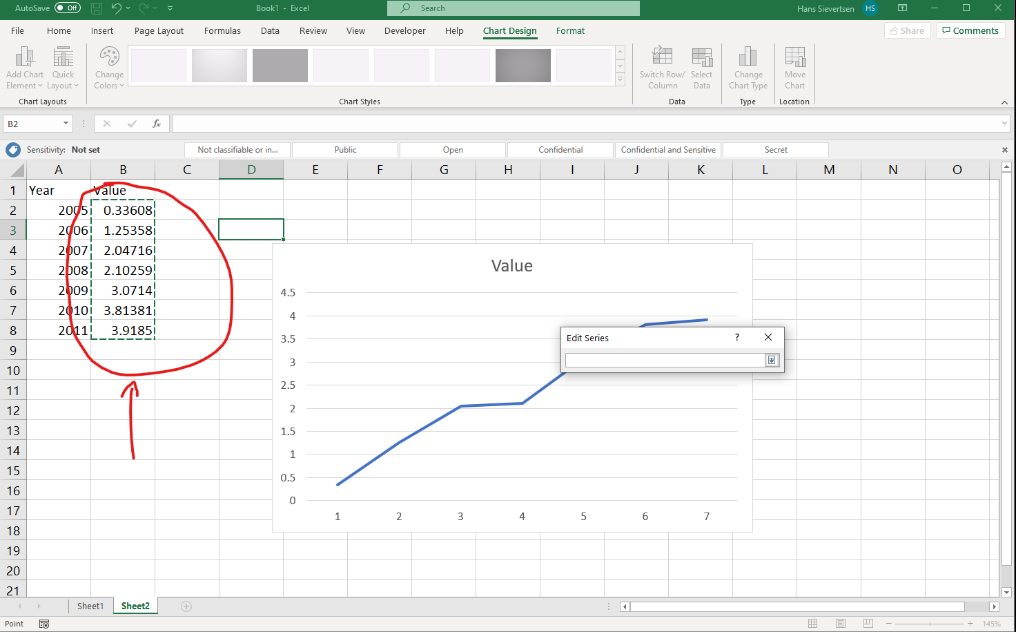
Back at the menu, we should already see our line. click “OK” to complete the series entry.
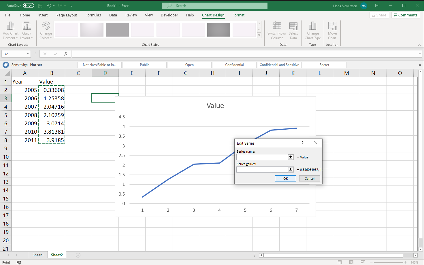
We might think we are done now, but wait! Look at the horisontal axis. It just shows values 1 to 7 and not the years from column A! We haven’t told Microsoft Excel what valus to use on the horisotnal axis yet.
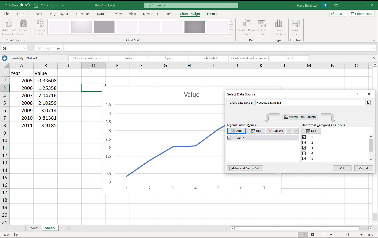
Click “Edit” in the right panel to select the series for the horisontal axis.
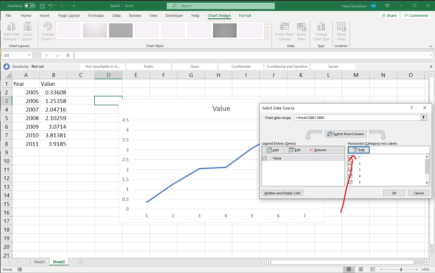
Follow the same procedure as for the data on the vertical axis and select the data for the horisontal axis and click OK.
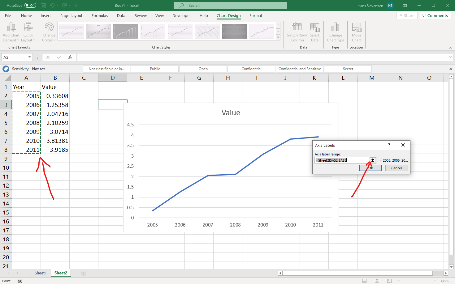
Back at the menu things already look good. Click “OK” to finish the “Select Data” procedure.
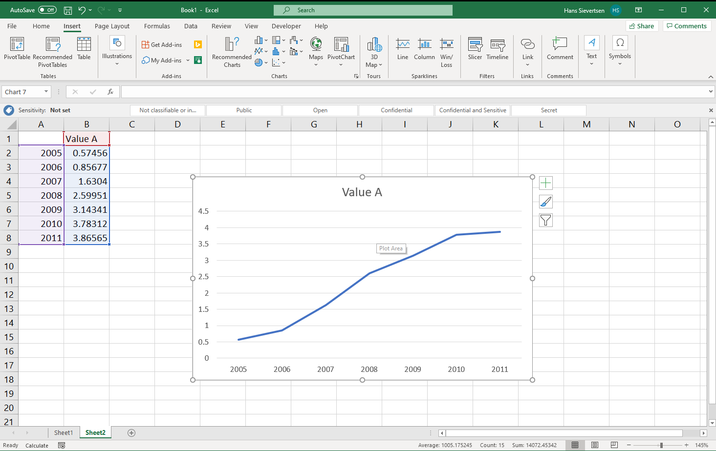
Looks good! Our first line chart!
What if the canvas is not blank?
If we (accidently) selected some of the data before clicking on “Insert line chart” as in the example below…
… it is very likely that Microsoft Excel produces something like the below. What is that? What happens is that Microsoft Excel make sa guess of what data you want to use where. Because it sees two columns with column headers it believes that you want to show both series on the vertical axis. So instead of showing Year on the horisontal axis it is shown on the vertical axis.
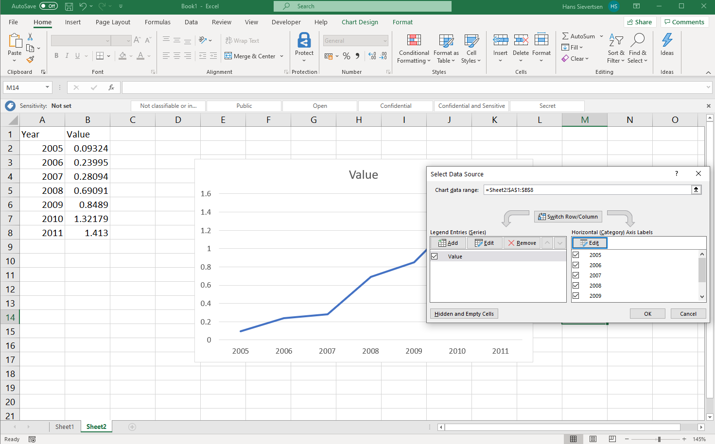
What can we do in that case? One solution is to select the chart area and press delete and start over. Another alternative is to go to the select data menu just like we did above. In the select data menu we highlight the row with “Year” in the left panel and click “Remove” to remove the Year series from the vertical axis. After that we can just follow the steps above and add the Year series to the horisontal axis using the right panel.
Getting Microsoft Excel to make the right guess
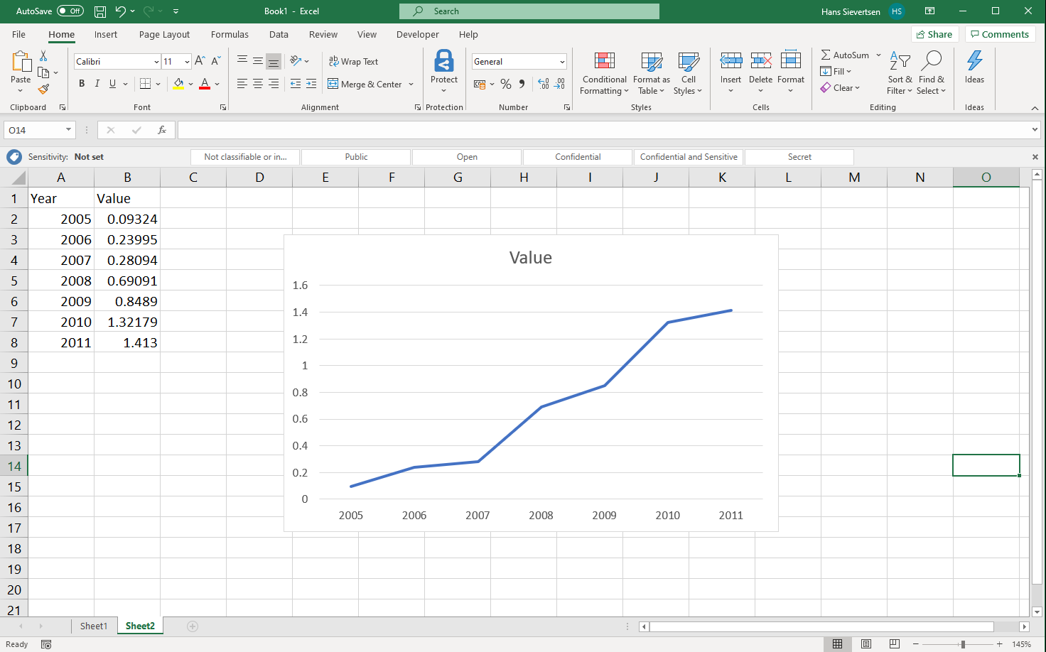
How could we help Microsoft Excel to make the right guess? That is simple. Remove the header for the Year series. And follow the same steps as below. If the data structure is like below, we can do all we did above in one quick step by selecting all the data and clicking insert line chart.
Voila! We have line chart with the right data series on the right axes.
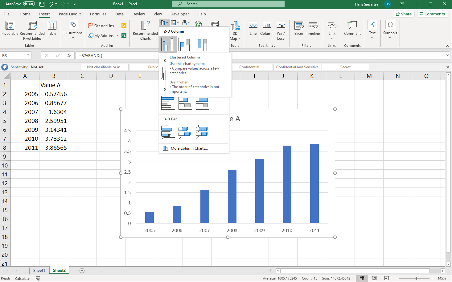
4.2 A bar chart
To create a bar chart we follow the same steps as for the line chart, we just select the bar chart icon above the line chart icon (see below). The data selection procedure is just like for the line chart.
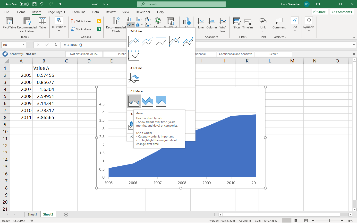
4.3 An area chart
We can find area charts within the line chart menu as illustrated below. The data selection procedure is just like for the line chart.
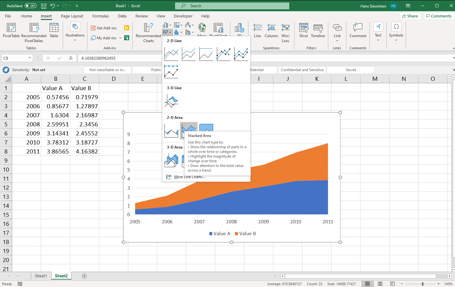
4.4 A stacked area chart
A stacked area chart puts the series on top of each other. For the example below we have two series that we put on top of each other. The stacked area chart is just to the right of the line chart. The data selection procedure is just like for the line chart.
4.5 An unstacked area chart with two series
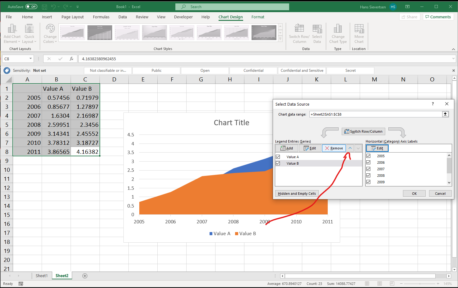
If we do not stack our series and create an area chart with two series, one series might cover the other series. It is therefore important that the ordering of the series is as desired. We can change the order in the “Select data” menu by highlighting a series in the left panel (just click on it) and clicking on the small arrows (see below) to change the ordering.
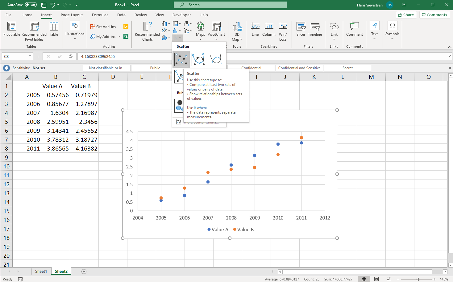
4.6 A scatter plot
Scatter plots work slightly differently than line charts, bar charts, and area charts in Microsoft Excel. Let’s try it. You will typically find the scatter plot icon in the lower row of the chart area in the ribbon, as shown below.
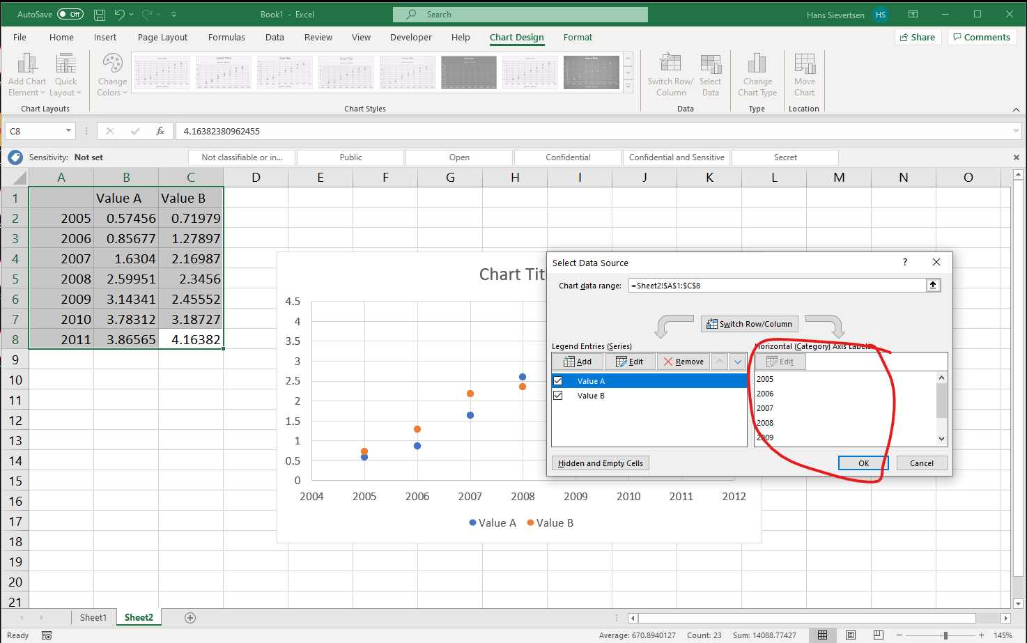
If we go to the “Select data” menu for the scatter plot we see that the right panel for the horisontal axis is “greyed out”. We cannot modify that part. That is because each seres has their own series on the vertical and horisontal axis.
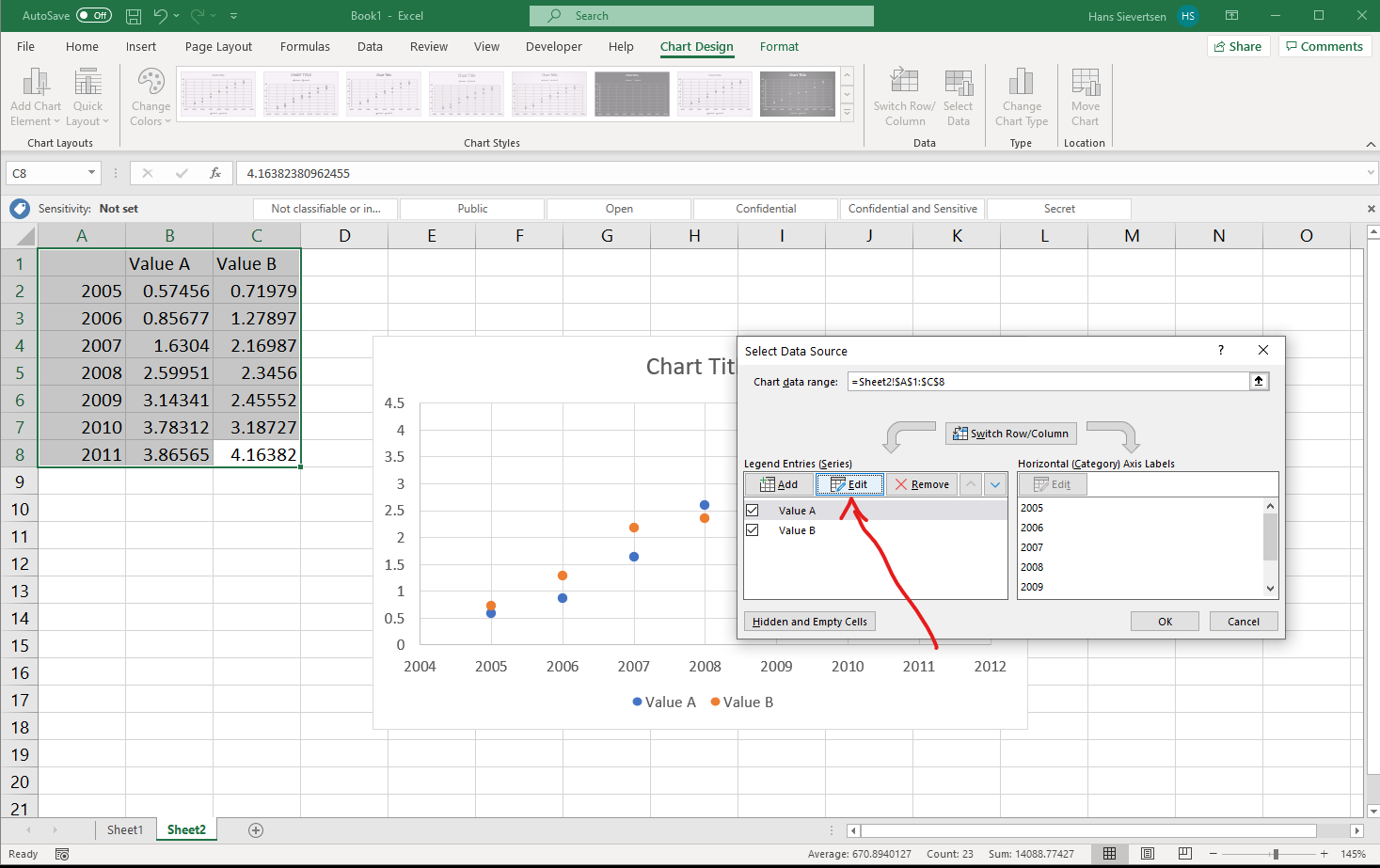
Let’s select “Edit” in the left panel to modify the data selection for one of the series. Recall that for the other charts we only changed the title of the series and the values on the vertical axis. However…
…in a Scatter plot, we specify both the values to use on the vertical and the horisontal axis for each series individual. We have one additional row in the select data menu, as shown below.
In many cases we don’t need to worry about this difference, however, it gives us more flexibility, because we can select the series independently.
4.7 A pyramid chart
Pyramid charts are often used to show the composition of the population by age and gender. In practice we can create a pyramid chart as a bar chart. We then multiply the values for one gender by -1 and later remove the “-” from the x axis, as shown below.
4.8 Polishing the chart
Missing data points
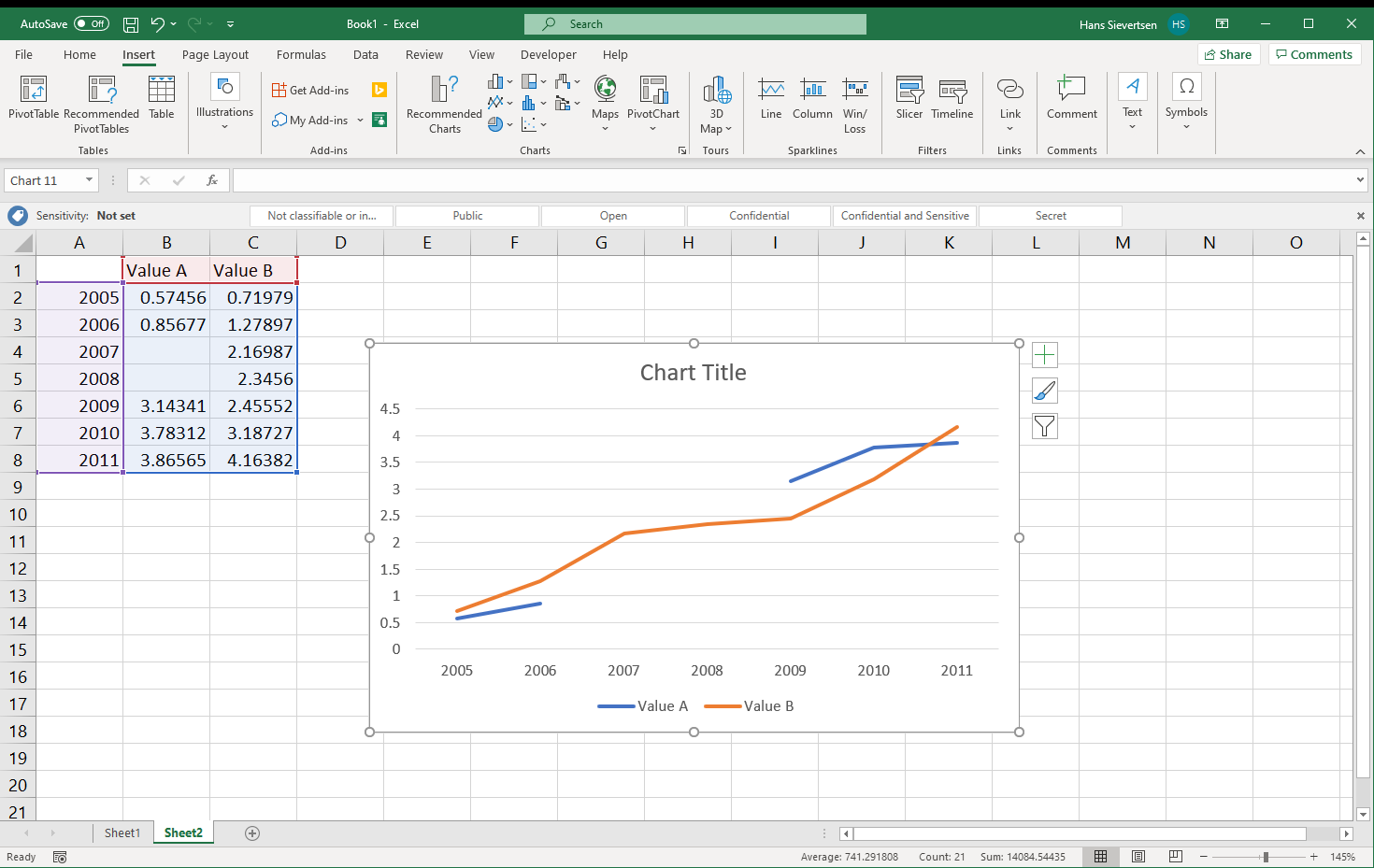
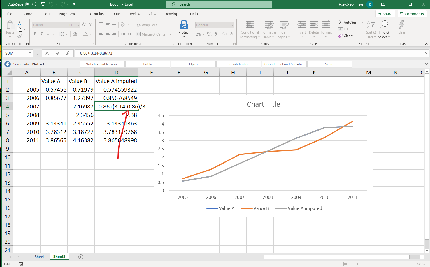
Real-World data is often incomplete. Like in the example below, we don’t observe any values for Value A in the years 2007 and 2008. This will lead to a gap in the line chart. This is typically fine and in line with what the data shows. However, in some cases we might want to make a guess of what these missing values could be. Our guess is that we can draw a straight line between the last observed value and the next observed value. This is called linear interpolation.
We can make Microsoft Excel draw a straight line between the last observed value and the next observed value by manually calculating what the values in the gaps are as in the example below.
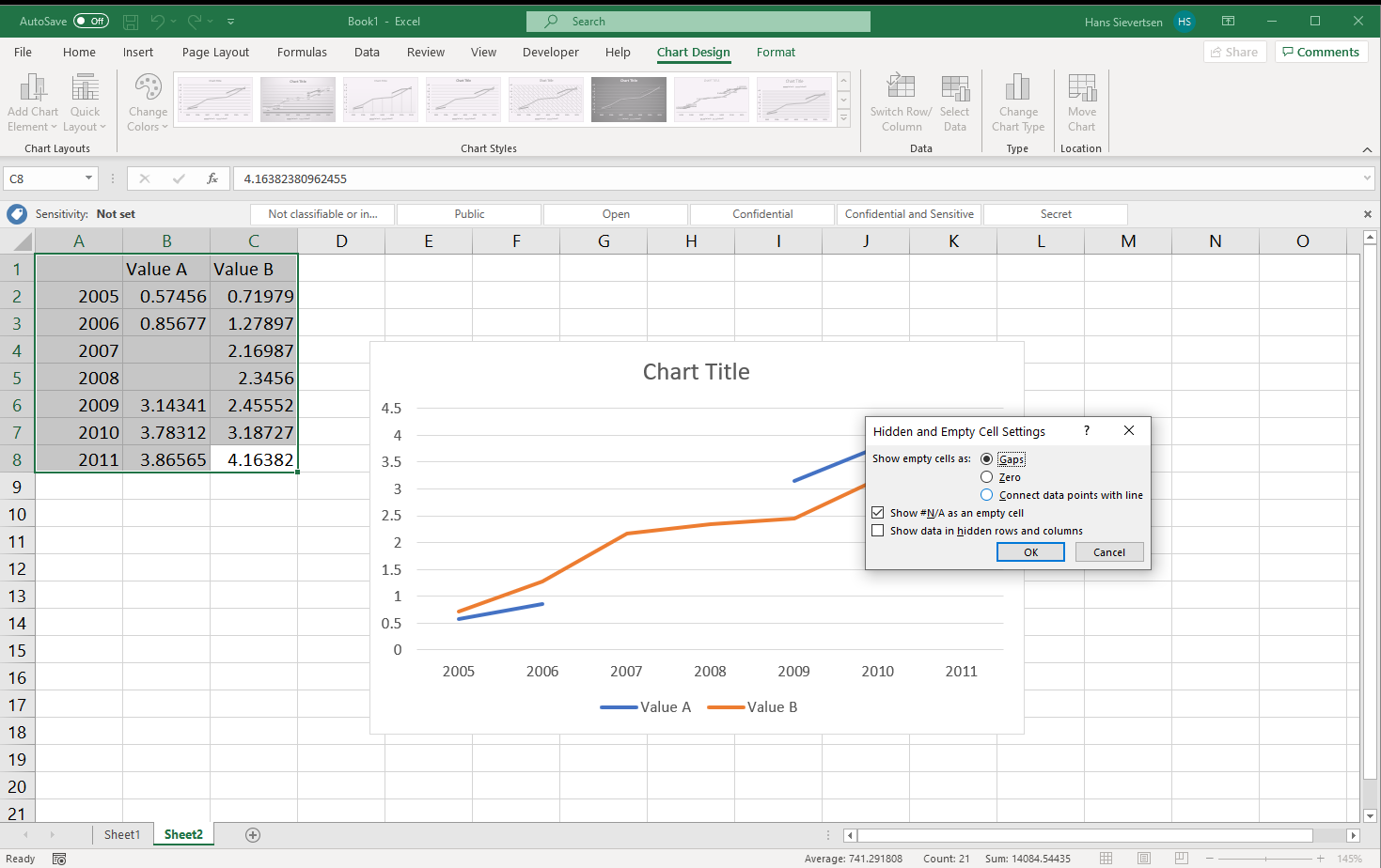
However, Microsoft Excel includes a function to do the linear interpolation and draw straight lines for us. To use this function simply go to the “Select data” menu and click on the “Hidden and Empty Cells” button in the lower left corner.
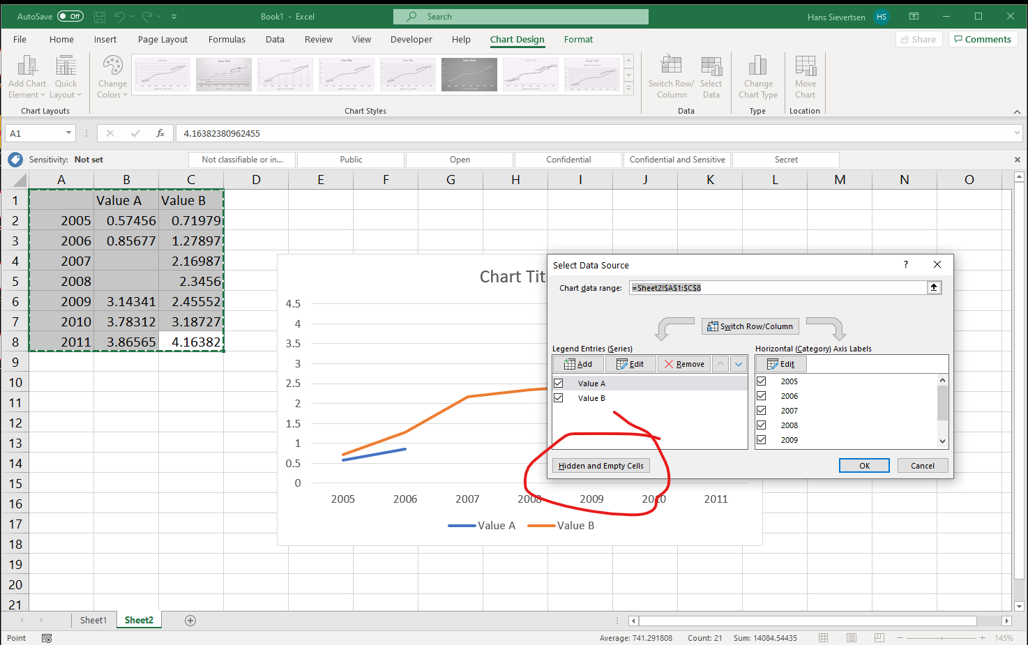
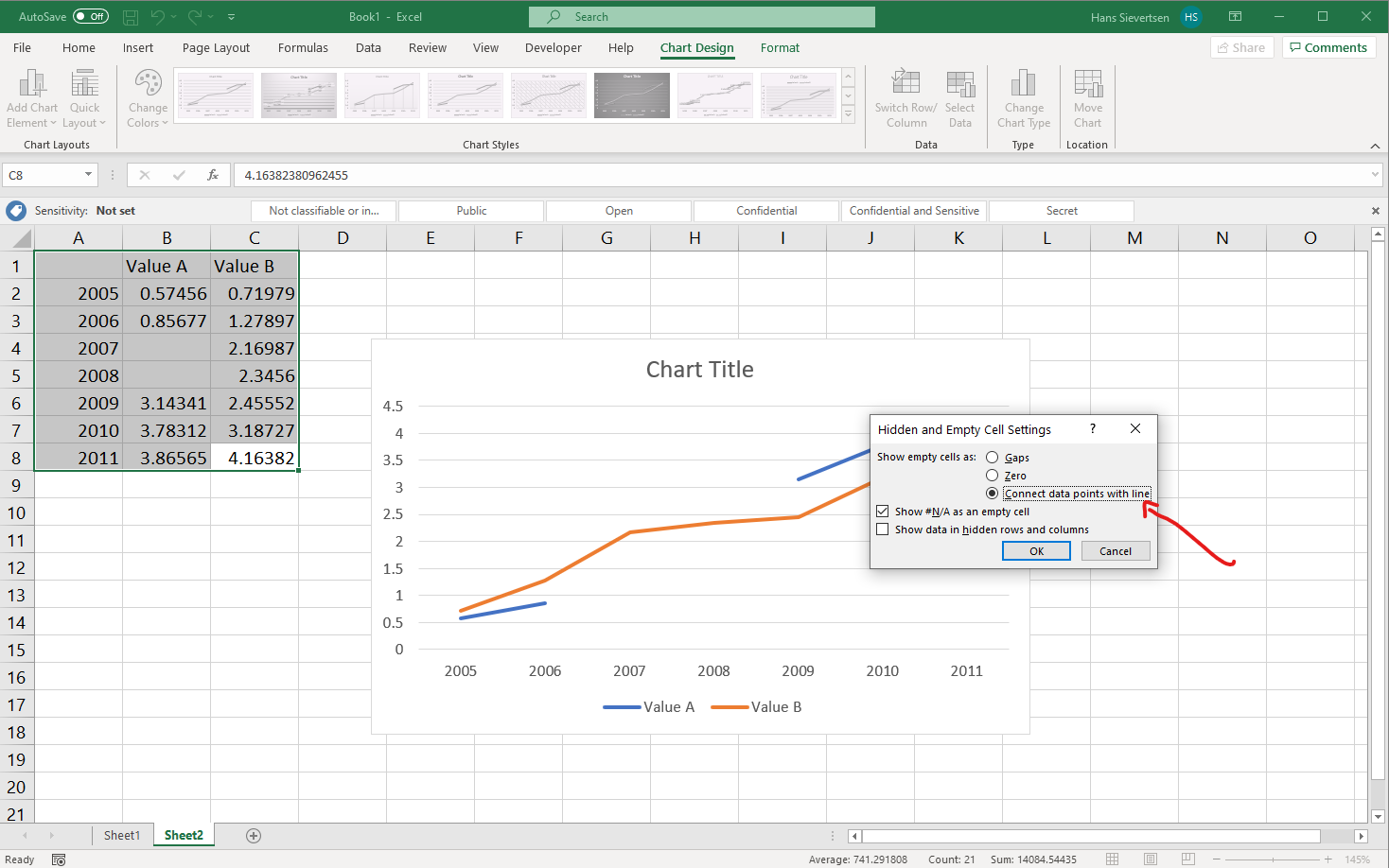
In the new menu, select “Connect data points with line”, to connect values.
Voila! Microsoft Excel did all the work for us!
Numerical values on the horisontal axis
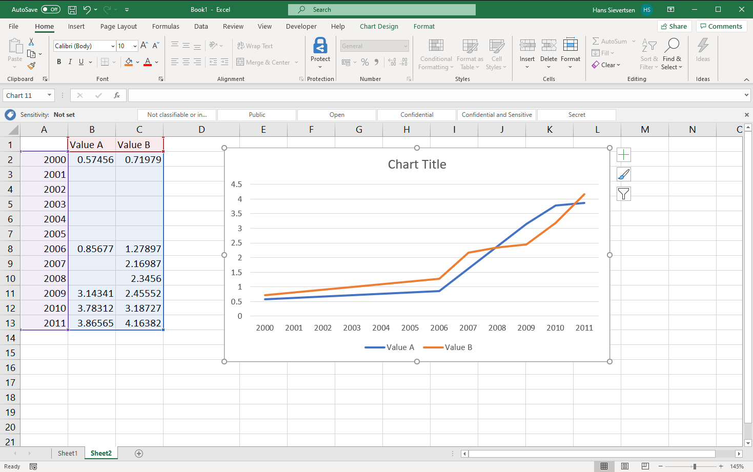
You don’t always make brilliant decisions. One example is my decision not to include Kevin de Bruyne in my Fantasy Premier League Team in the season 2019/20. Another example is Microsoft’s decision to treat the horisontal axis in a line chart as categorical. I do not understand that because it is meaningless to connect values with a line that are categorical. But that is what they do!
What is the problem with treating the horisontal axis as categorical? The problem is that the numerical values are not given any importance by Microsoft Excel when generating the chart. Take a look at the chart below. The first value on the horisontal axis is 2000. The second value is 2006. The third value is 2007. The distance between 2000 and 2006 is the same as the distance from 2006 and 2007. That is misleading and not what we want. That is because Microsoft Excel ignores that 2000 is actually a number. It just treats it as text. What can we do to solve this issue?
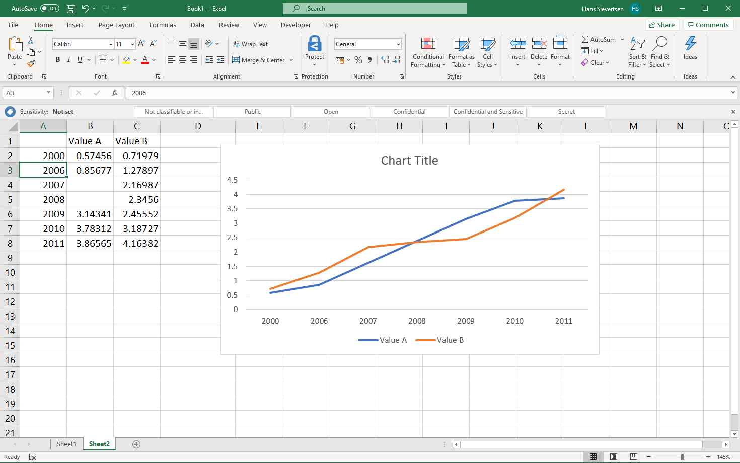
One solution is to manually add all the data points between 2000 and 2006 as in the example below (remember to connect lines across missing data points, as explained above).
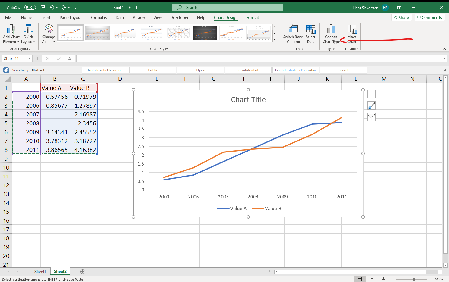
However, manually adding empty dataseries is not the best use of our time. There is an alternative solution: Scatter plots! Scatter plots differ from line charts (and bar charts, area charts etc) in that the horisontal axis is treated as numerical by default.
To change the chart type, click on “Change chart type” as shown below (you have to select your chart and select the Chart Design tab to see this option). You can also right-click on the chart and select “Change chart type”.
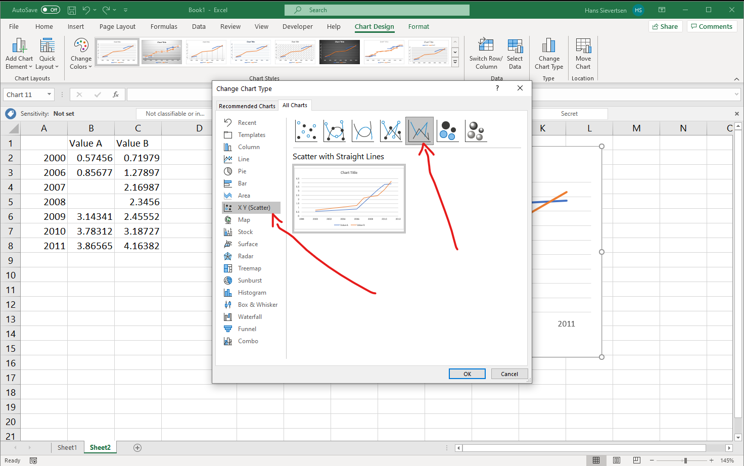
In the Change Chart Type menu select “X Y (Scatter)” and select the line chart chart as shown below. Don’t ask me why Microsoft Excel includes a line chart in the Scatter menu.
Voila! It works! The distance on the horisontal axis is now consistent with the values shown.
Formating axes
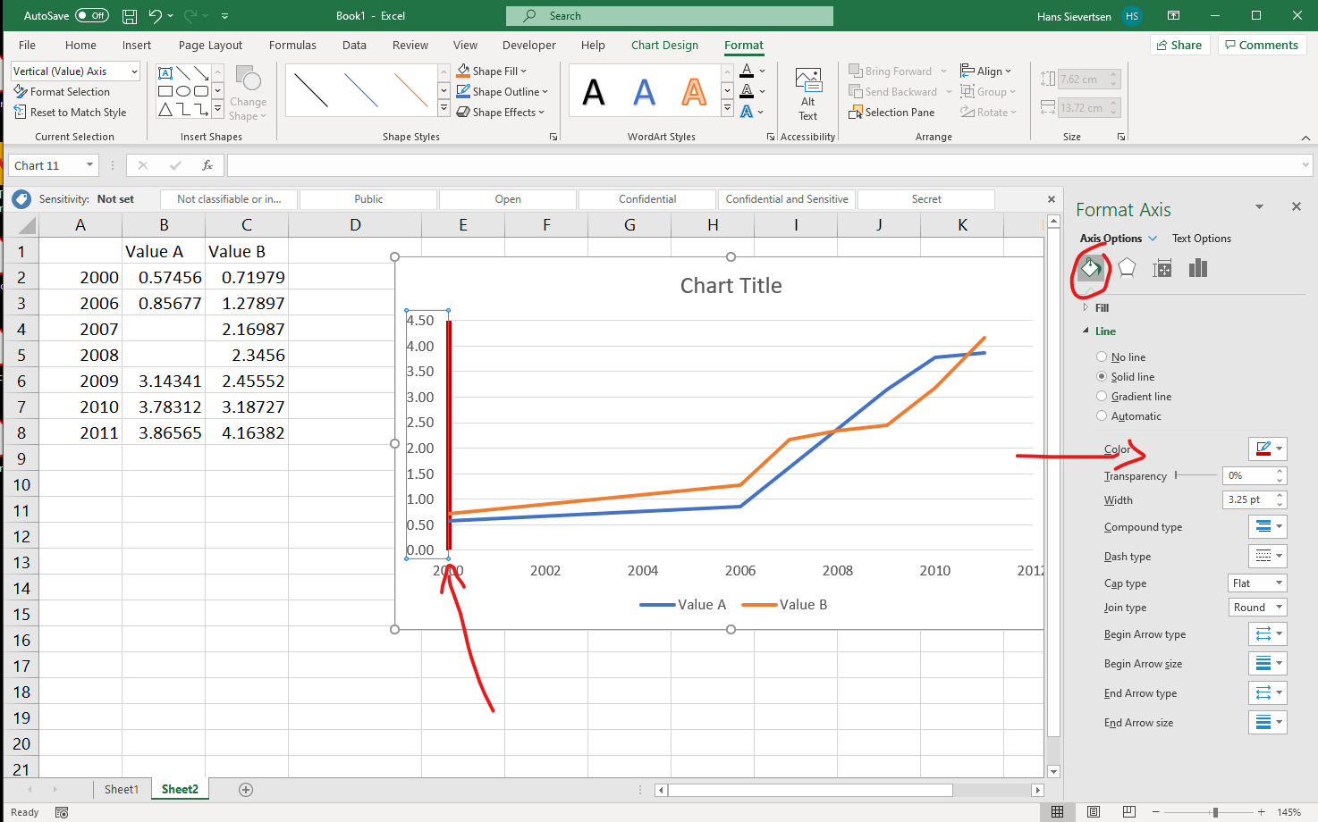
We can modify the axes scales and appearance. To change an axis, simply click on the axis (for example on one of the tick labels). If you’ve selected the “Format” tab, the ribbon will tell you what you’ve selected in the upper left corner (in the example below “Horizontal (Value) Axis”). We can then click “Format Selection” (or right-click on the axis and select “Format Axis”).
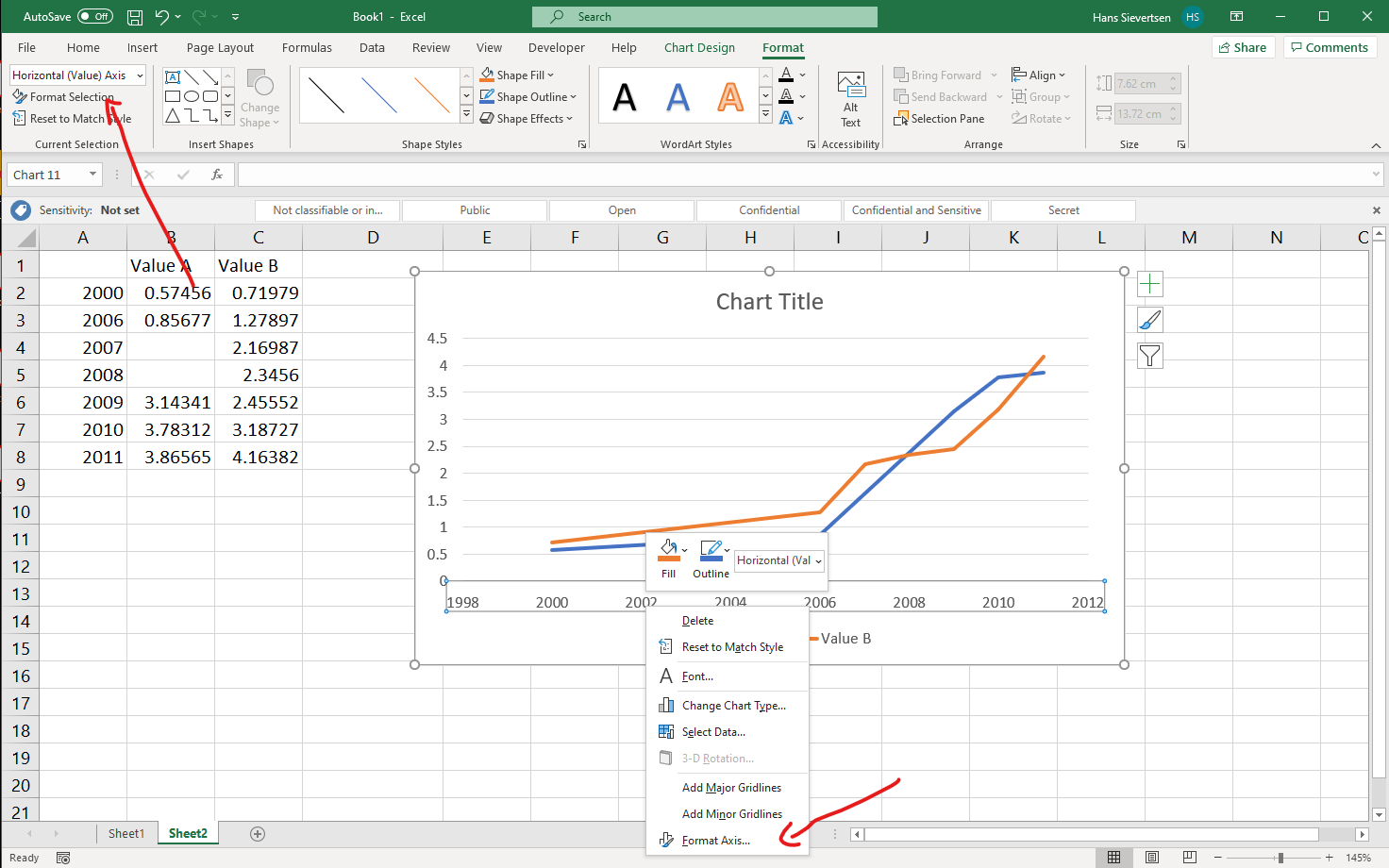
This opens a menu on the right as shown below.
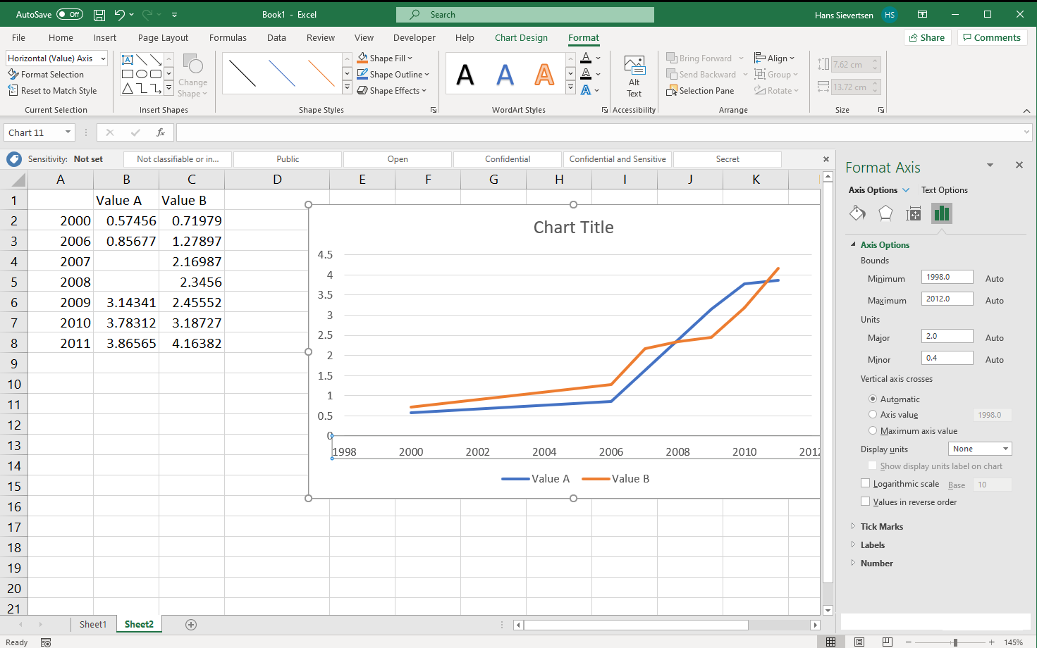
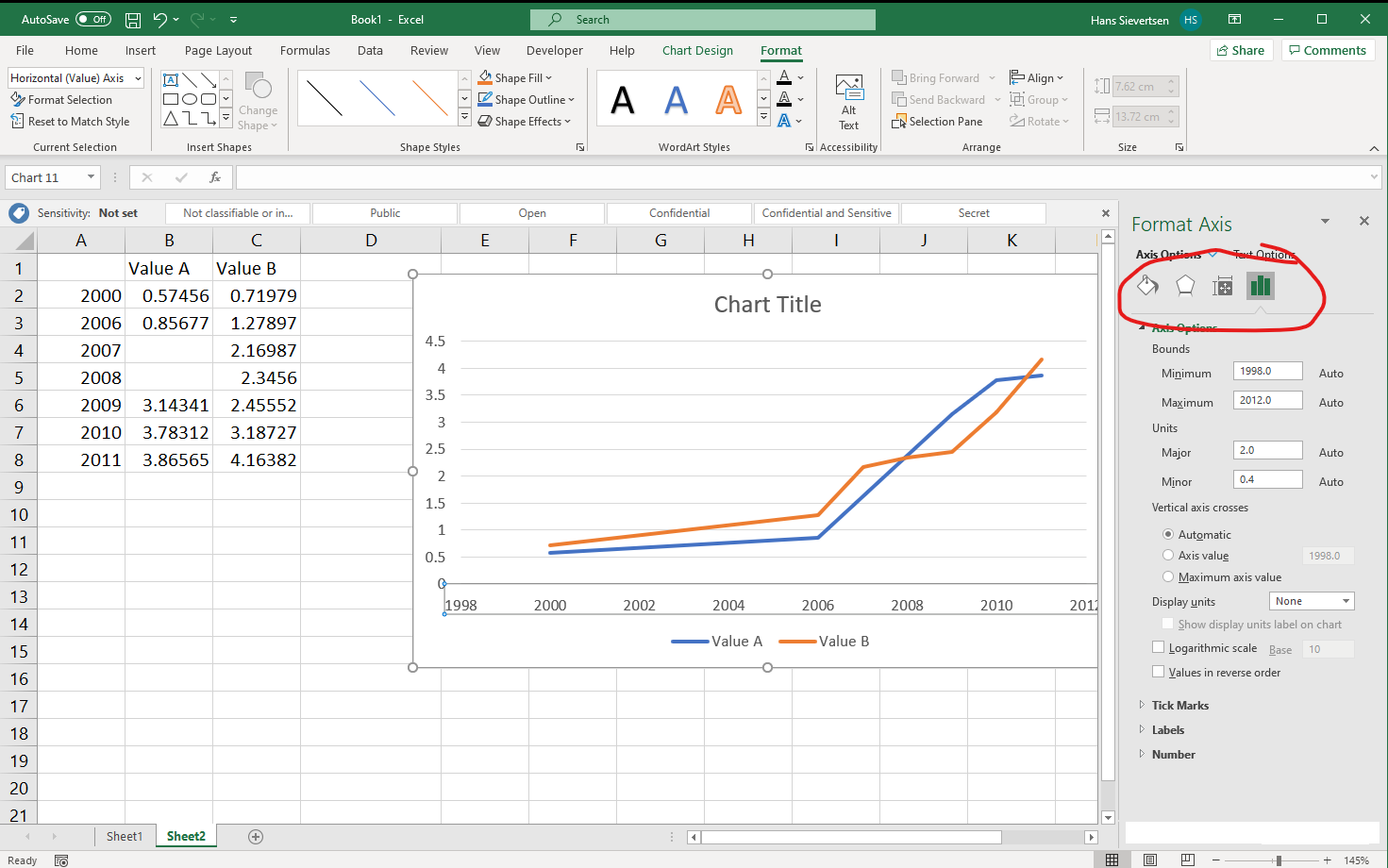
The menu consists of four categories (see below). The right-most category (the little bar chart symbol) allows us to change the scale and units on the axis.
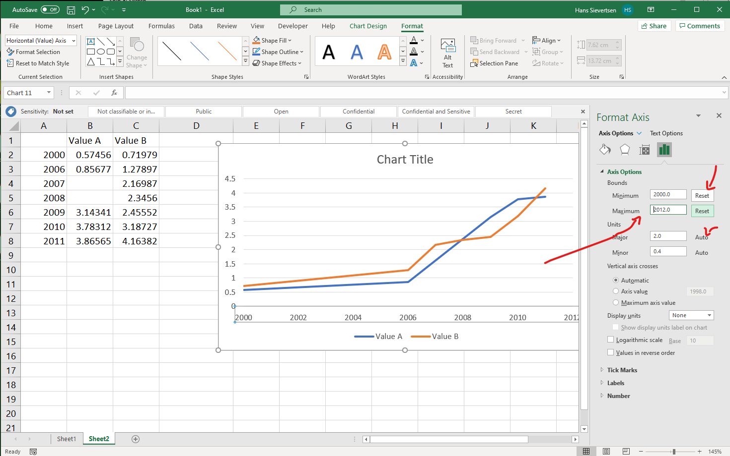
We can modify the beginning and end value of the axis (or click “Reset” to let Microsoft Excel determine it automatically).
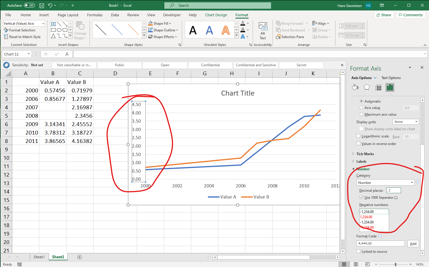
We can also change the appearance of the axis tick labels, by scrolling down to the “Number” section as shown below. In the example below we’ve told Excel to treat the labels on the vertical axis as numbers with two decimal places.
As shown in the example below, in the left-most menu we can change the colouring of the axis line, the line shape, the line thickness and other appearance aspects.
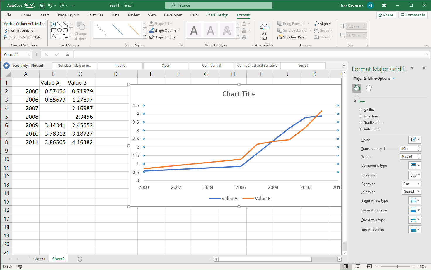
Formating other chart elements
We can modify almost all chart elements. We simply select the element we want to change and click “Format Selection” in the ribbon (or right-click and click Format…). In the example below we’ve selected the grid lines. We can then change the appearance of these grid lines in the menu on the right.
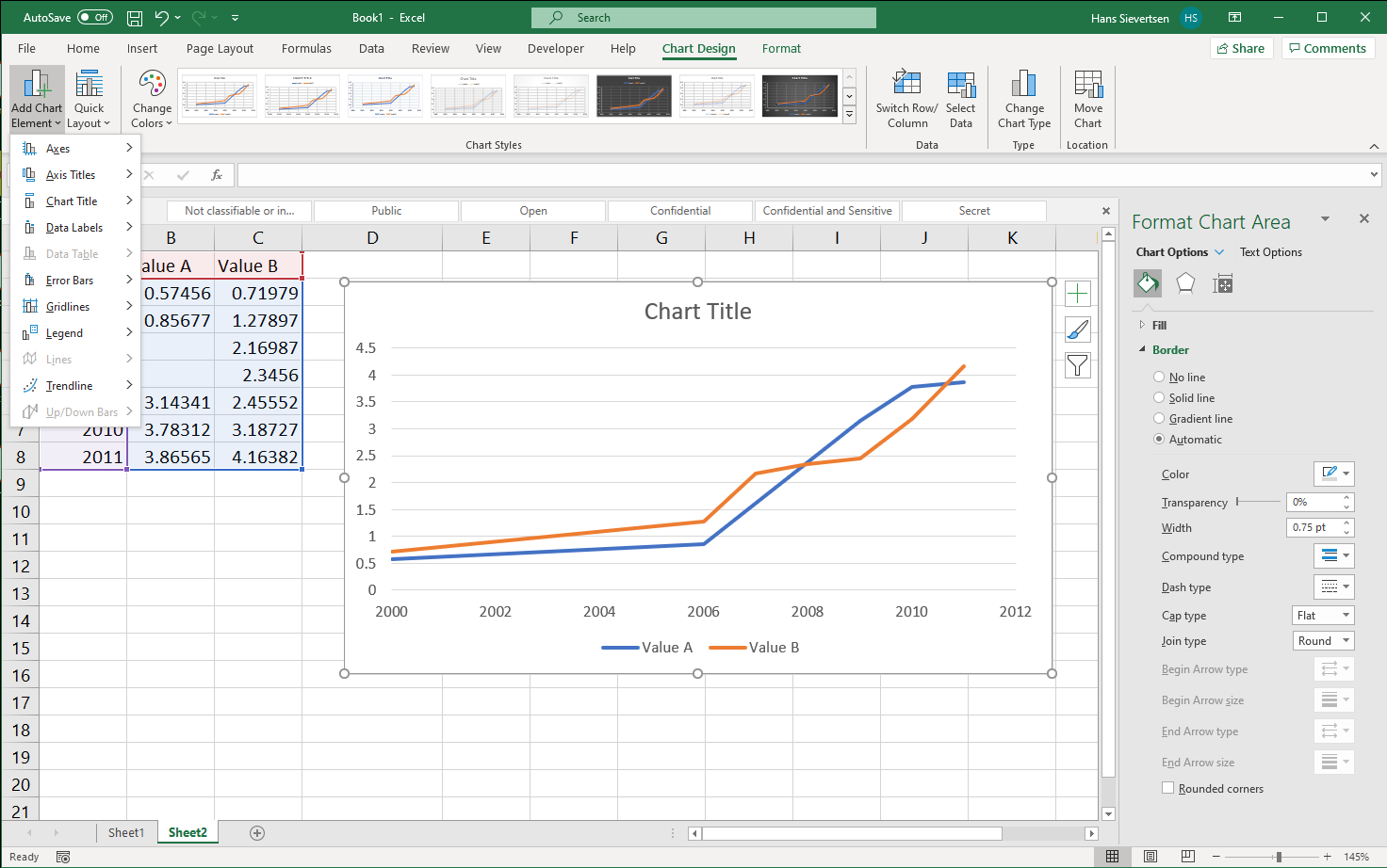
Adding chart elements
We can add chart elements in the Chart Design Tab by clicking Add Chart Element in the left-most part of the ribbon as shown below. we can also click on the big “+” symbol to the right of the chart.
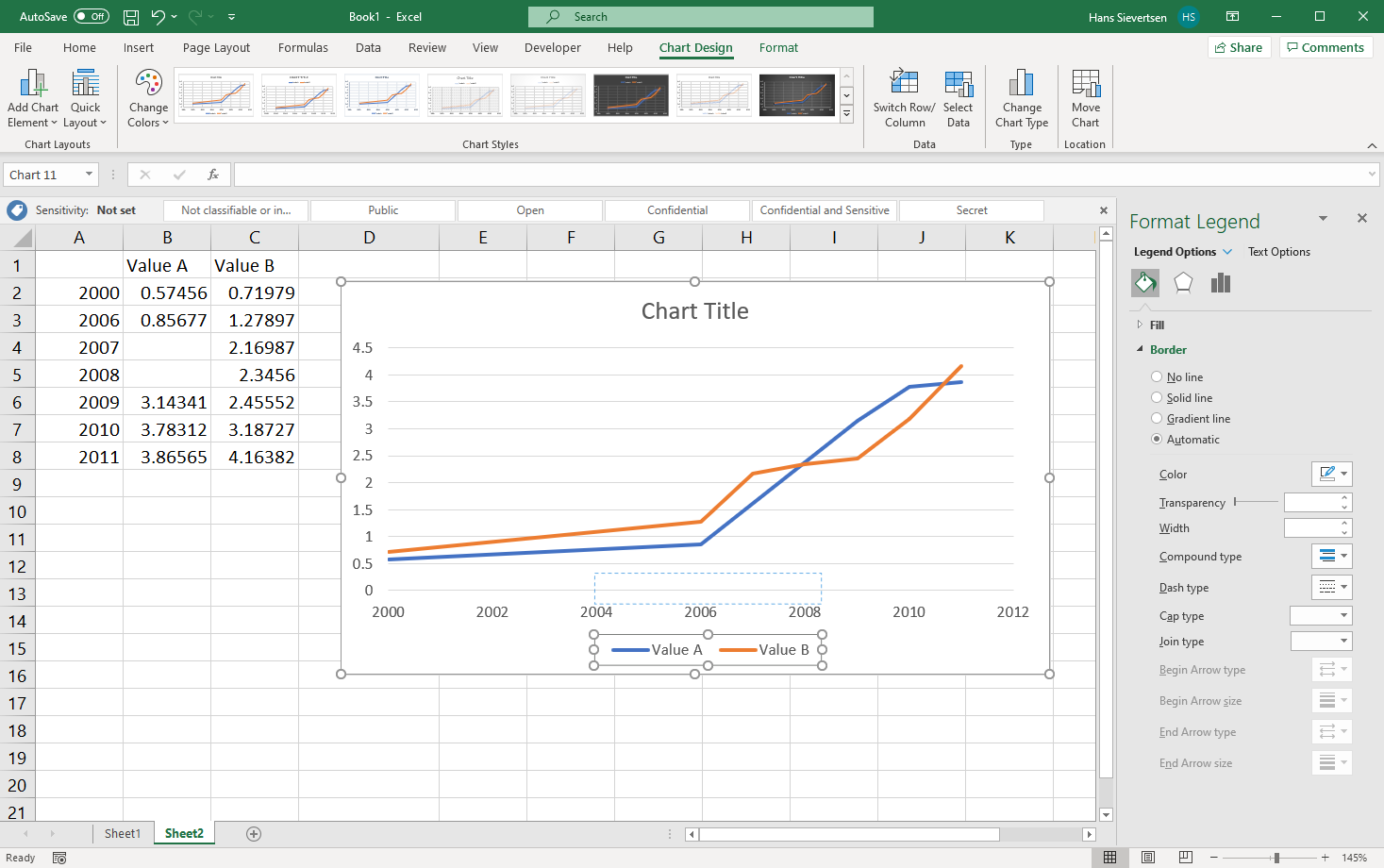
Moving chart elements
We can move chart elements by simply selecting and dragging them as shown for the legend below.
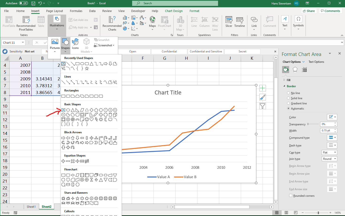
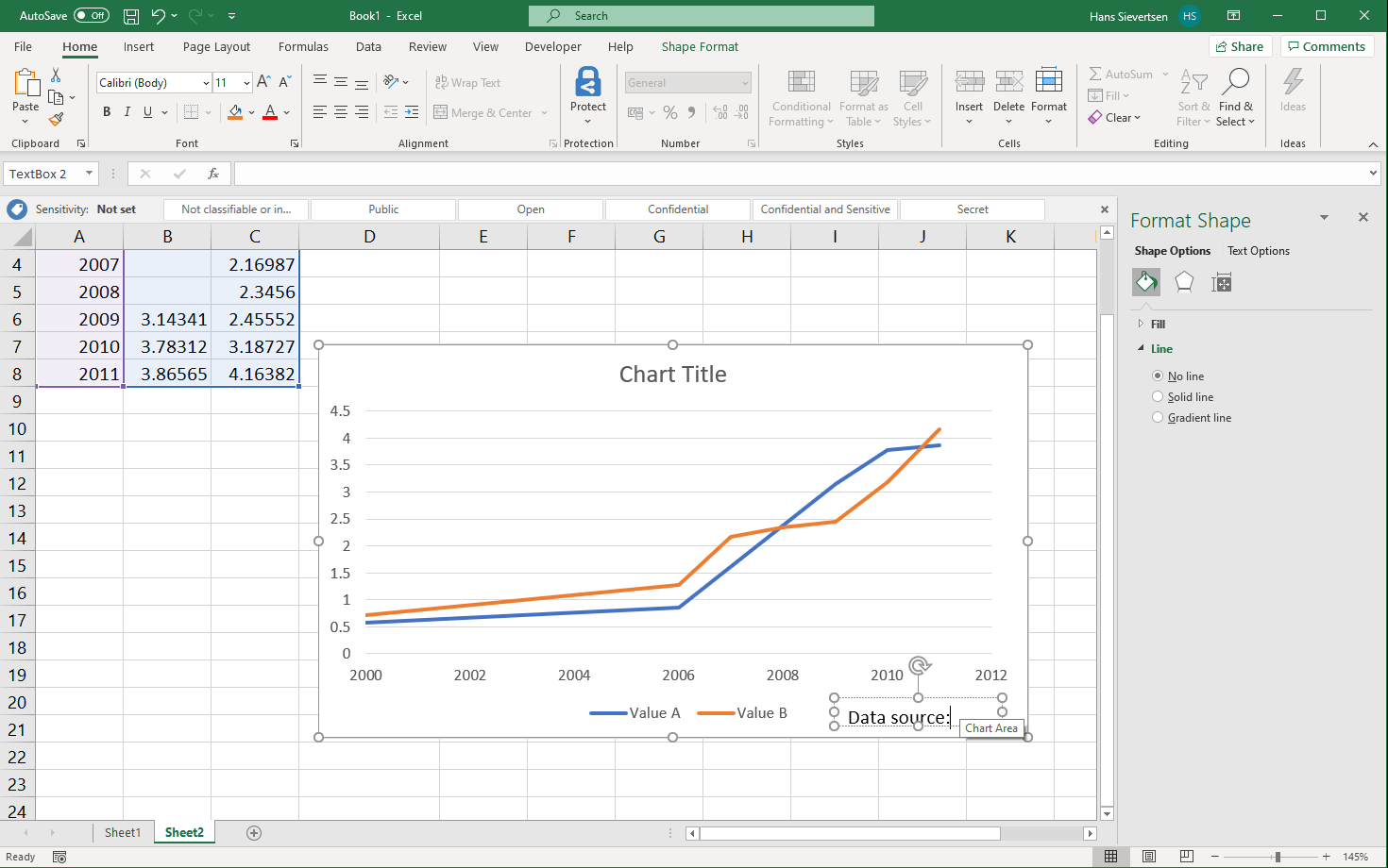
Inserting a text box
We can insert a text box in our chart (and other shapes), for example to include a note about value imputation and data sources. Simply select the “Insert” tab and then select Illustrations and Shapes. It is important that the chart canvas is selected when selecting this menu.
4.9 Combing chart types
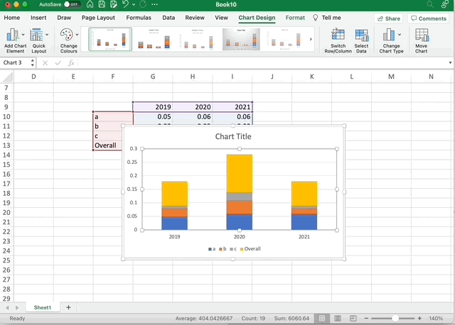
We can combine several chart types in one chart as shown below
Windows
Mac